[1/5] Statistic for Business Technique: Lift and Gain Analysis
The first part of the email course series regarding Statistic for Business Technique
Hello all, I want to start an initiative to create an email course starting today, which I plan to have many in the future. For this series, I want to create an email course to learn about the statistic analysis technique used in the business.
Why are statistics for business important? As we know that data science is a new science in the industry and not understood well by the public space. What we do as data people might be useful; however, if the business people did not understand anything about our analysis, then it is useless.
That is why I want to present a few statistical analysis techniques suitable in the business and can be used in the industry. Also, knowing these following techniques could make you stand out from your peers or other applicants.
In the first part of this series, I want to introduce the statistic technique called Lift and Gain analysis.
So, what is Lift and Gain analysis? Lift and Gain analysis is an analysis to measure how much better our prediction model is compared without the model. It is often used to measure how our model impacts the business. We might have many metrics such as Accuracy, Precision, F1 Score, ROC-AUC, and many more, but these metrics did not reflect how the model would do business-wise. That is why we could use Lift and Gain analysis to measure the impact.
In a typical Lift and Gain analysis, the analysis result would be presented in the chart below.
Gain and lift charts are visual aids for evaluating the performance of classification models. Unlike the confusion matrix that evaluates the overall population, the Gain and Lift chart evaluates model performance in a portion of the population. This means we evaluate the model in terms of the benefit we could get using the model in a portion of the population.
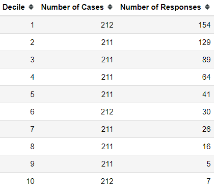
The Gain and Lift analysis benefit come from how often our 80% revenue comes from 20% of the customers in the business. This is the main part of the decile analysis used in the Gain and Lift chart calculation. The decile analysis is presented in the chart below.

How Decile Analysis is applicable in the Gain and Lift analysis? Let’s take a few steps back and explain how to Gain and Lift analysis calculated from the beginning.
As I mentioned previously, the Gain and Lift chart is used to evaluate the classification model. For the sake of example, let’s create a prediction model. In this article, I would use the churn data from Kaggle.
import pandas as pd
churn = pd.read_csv('churn.csv')
In this dataset, we have 21 columns with the target is customer churn. This means we would develop a classification prediction model to predict the customer churn. For simplicity, I would clean the data for modelling purposes.
#Drop Customer ID
churn = churn.drop('customerID', axis = 1)

#Change Ordinal data to numerical
for i in ['Partner', 'Dependents', 'PhoneService', 'OnlineSecurity',
          'OnlineBackup', 'DeviceProtection', 'TechSupport', 'StreamingTV', 'StreamingMovies', 'PaperlessBilling', 'Churn']:
    churn[i] = churn[i].apply(lambda x: 1 if x == 'Yes' else 0)

#OHE categorical data
churn = pd.get_dummies(churn, columns = ['gender', 'MultipleLines', 'InternetService', 'Contract', 'PaymentMethod'], drop_first = True)

#Change object data into numerical
churn['TotalCharges'] = churn['TotalCharges'].apply(lambda x: 0 if x == ' ' else float(x))
After cleaning the data, we would try to develop the prediction model. For this article, I would use the Logistic Regression model.
#Import the model
from sklearn.model_selection import train_test_split
from sklearn.linear_model import LogisticRegression

#Splitting the model
X_train, X_test, y_train, y_test = train_test_split(churn.drop('Churn', axis =1), churn['Churn'], test_size = 0.3,stratify = churn['Churn'], random_state = 101)
model = LogisticRegression()
model.fit(X_train, y_train)
With our model is set, we would start to make our Gain and Lift analysis to evaluate this model. As a comparison, we would evaluate the model using the usual metrics.
from sklearn.metrics import classification_report
predictions = model.predict(X_test)
print(classification_report(y_test, predictions))
As we can see from the image above, our model capability to predict the churned customer (class 1) is lower. Would our model still have a benefit if we applied it in the business? Let’s see it using the Gain and Lift analysis.
The first step in the Gain and Lift analysis is to get the model prediction probability of class 1 based on the test data and order it in descending order.
#Getting the prediction probability of class 1 and order it by descending order
X_test['Prob']  = model.predict_proba(X_test)[:,1]
X_test = X_test.sort_values(by = 'Prob', ascending = False)
X_test['Churn'] = y_test
When we obtained the probability and order it descendingly, we would divide the data into deciles. This is similar to the decile analysis in the above image; we divide the data into 10 sets and label it.
#Divide the data into decile
X_test['Decile'] = pd.qcut(X_test['Prob'], 10, labels=[i for i in range (10, 0, -1)])
After dividing the data by decile, we need to calculate the actual churn (actual class 1, not predicted) in each Decile. This motion I called the Number of Responses.
#Calculate the actual churn in each decile
res = pd.crosstab(X_test['Decile'], X_test['Churn'])[1].reset_index().rename(columns = {1: 'Number of Responses'})

lg = X_test['Decile'].value_counts(sort = False).reset_index().rename(columns = {'Decile': 'Number of Cases', 'index': 'Decile'})

lg = pd.merge(lg, res, on = 'Decile').sort_values(by = 'Decile', ascending = False).reset_index(drop = True)
In the image above, we obtain the Number of Cases (The number of data in the decile) and the Number of Responses (The number of actual positive data in each decile). With this number, we were able to calculate the Gain number.
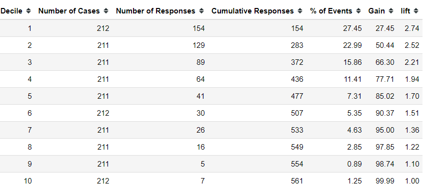
For information. Gain is the ratio between the cumulative number of the Number of Responses (Actual Positive) up to each decile divided by the total number of positive observations in the data. Let’s try to calculate it in our data.
#Calculate the cumulative
lg['Cumulative Responses'] = lg['Number of Responses'].cumsum()

#Calculate the percentage of positive in each decile compared to the total nu
lg['% of Events'] = np.round(((lg['Number of Responses']/lg['Number of Responses'].sum())*100),2)

#Calculate the Gain in each decile
lg['Gain'] = lg['% of Events'].cumsum()
From the Gain image above, we could see that the Gain number is increasing for each decile, but the cumulative total decreases with the higher decile. What is the interpretation of the Gain? Gain is the percentage of targets (actual positive) covered at a given decile level. For example, in decile 2, we had a Gain of 50.44. It means 50.44% of targets are covered in the top 20% of data based on the model. In the churn model, we can identify and target 50% of customers who are likely to churn by just targeting 20% of total customers. Business-wise, it means with fewer resources, we could potentially avoid a 50% churn event.
Next, we need to calculate the Lift. The lift would measure how better we can expect to do with the predictive model than without the model.
lg['Decile'] = lg['Decile'].astype('int')
lg['lift'] = np.round((lg['Gain']/(lg['Decile']*10)),2)
The lift could be interpreted as the gain ratio to the random percentage at a given decile level. In a layman term, in decile 2, we have 2.52 means that when selecting 20% of the data based on the model, we could find the target (actual positive) 2.52 times more than the randomly selected 20% of the data without a model.
Let’s try to visualize the Gain and Lift chart compared to the random picking.
In the image above, we could evaluate the model by measuring the Gain and Lift model compared to the random—the Greater the area, the Better the model. Our model is good in prediction because the chart has shown that the model allowed a greater Gain and Lift than the random picking. Business-wise, the churn is found better with using the model; means fewer resources to spend.
Conclusion
Model evaluation is important for the data scientist work; however, we need to evaluate the model based on the business usefulness. It is not enough to rely on the technical metrics but on how our model impacts the business. In this article, I have explained Lift and Gain analysis useful to evaluate the model in terms of business by using:
Gain number (Percentage of target covered in each decile)
Lift number (gain ration percentage to the random percentage at a given decile level)
That is all for the first part of the five-part series of Statistical for Business Technique. Please consider subscribing if you want to support me and accessing the paid-only content!


