4 Pandas Plotting Function You Should Know
Few easy plotting by Pandas you might never knew before
Few easy plotting by Pandas you might never knew before

Pandas is a powerful package for data scientists. There are many reasons we use Pandas, e.g. Data wrangling, Data cleaning, and Data manipulation. Although, there is a method that rarely talks about regarding Pandas package and that is the Data plotting.
Data plotting, just like the name implies, is a process to plot the data into some graph or chart to visualise the data. While we have much fancier visualisation package out there, some method is just available in the pandas plotting API.
Let’s see a few selected method I choose.
1. radviz
RadViz is a method to visualise N-dimensional data set into a 2D plot. The problem where we have more than 3-dimensional (features) data or more is that we could not visualise it, but RadViz allows it to happen.
According to Pandas, radviz allows us to project an N-dimensional data set into a 2D space where the influence of each dimension can be interpreted as a balance between the importance of all dimensions. In a simpler term, it means we could project a multi-dimensional data into a 2D space in a primitive way.
Let’s try to use the function in a sample dataset.
#RadViz exampleimport pandas as pdimport seaborn as sns#To use the pd.plotting.radviz, you need a multidimensional data set with all numerical columns but one as the class column (should be categorical).mpg = sns.load_dataset('mpg')pd.plotting.radviz(mpg.drop(['name'], axis =1), 'origin')Above is the result of RadViz function, but how you would interpret the plot?
So, each Series in the DataFrame is represented as an evenly distributed slice on a circle. Just look at the example above, there is a circle with the series name.
Each data point then is plotted in the circle according to the value on each Series. Highly correlated Series in the DataFrame are placed closer on the unit circle. In the example, we could see the japan and europe car data are closer to the model_year while the usa car is closer to the displacement. It means japan and europe car are most likely correlated to the model_year while usa car is with the displacement.
If you want to know more about RadViz, you could check the paper here.
2. bootstrap_plot
According to Pandas, the bootstrap plot is used to estimate the uncertainty of a statistic by relying on random sampling with replacement. In simpler words, it is used to trying to determine the uncertainty in fundamental statistic such as mean and median by resampling the data with replacement (you could sample the same data multiple times). You could read more about bootstrap here.
The boostrap_plot function will generate bootstrapping plots for mean, median and mid-range statistics for the given number of samples of the given size. Let’s try using the function with an example dataset.
For example, I have the mpg dataset and already have the information regarding the mpg feature data.
mpg['mpg'].describe()We could see that the mpg mean is 23.51 and the median is 23. Although this is just a snapshot of the real-world data. How are the values actually is in the population is unknown, that is why we could measure the uncertainty with the bootstrap methods.
#bootstrap_plot examplepd.plotting.bootstrap_plot(mpg['mpg'],size = 50 , samples = 500)Above is the result example of bootstap_plot function. Mind that the result could be different than the example because it relies on random resampling.
We could see in the first set of the plots (first row) is the sampling result, where the x-axis is the repetition, and the y-axis is the statistic. In the second set is the statistic distribution plot (Mean, Median and Midrange).
Take an example of the mean, most of the result is around 23, but it could be between 22.5 and 25 (more or less). This set the uncertainty in the real world that the mean in the population could be between 22.5 and 25. Note that there is a way to estimate the uncertainty by taking the values in the position 2.5% and 97.5% quantile (95% confident) although it is still up to your judgement.
3. lag_plot
A lag plot is a scatter plot for a time series and the same data lagged. Lag itself is a fixed amount of passing time; for example, lag 1 is a day 1 (Y1) with a 1-day time lag (Y1+1 or Y2).
A lag plot is used to checks whether the time series data is random or not, and if the data is correlated with themselves. Random data should not have any identifiable patterns, such as linear. Although, why we bother with randomness or correlation? This is because many Time Series models are based on the linear regression, and one assumption is no correlation (Specifically is no Autocorrelation).
Let’s try with an example data. In this case, I would use a specific package to scrap stock data from Yahoo Finance called yahoo_historical.
pip install yahoo_historicalWith this package, we could scrap a specific stock data history. Let’s try it.
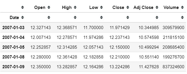
from yahoo_historical import Fetcher#We would scrap the Apple stock data. I would take the data between 1 January 2007 to 1 January 2017 data = Fetcher("AAPL", [2007,1,1], [2017,1,1])apple_df = data.getHistorical()#Set the date as the indexapple_df['Date'] = pd.to_datetime(apple_df['Date'])apple_df = apple_df.set_index('Date')Above is our Apple stock dataset with the date as the index. We could try to plot the data to see the pattern over time with a simple method.
apple_df['Adj Close'].plot()We can see the Adj Close is increasing over time but is the data itself shown any pattern in with their lag? In this case, we would use the lag_plot.
#Try lag 1 daypd.plotting.lag_plot(apple_df['Adj Close'], lag = 1)As we can see in the plot above, it is almost near linear. It means there is a correlation between daily Adj Close. It is expected as the daily price of the stock would not be varied much in each day.
How about a weekly basis? Let’s try to plot it
#The data only consist of work days, so one week is 5 dayspd.plotting.lag_plot(apple_df['Adj Close'], lag = 5)We can see the pattern is similar to the lag 1 plot. How about 365 days? would it have any differences?
pd.plotting.lag_plot(apple_df['Adj Close'], lag = 365)We can see right now the pattern becomes more random, although the non-linear pattern still exists.
4. scatter_matrix
The scatter_matrix is just like the name implies; it creates a matrix of scatter plot. Let’s try it with an example at once.
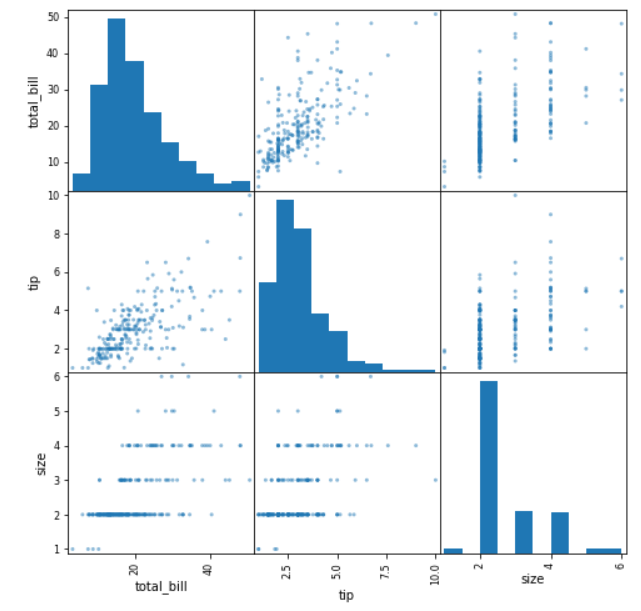
import matplotlib.pyplot as plttips = sns.load_dataset('tips')pd.plotting.scatter_matrix(tips, figsize = (8,8))plt.show()We can see the scatter_matrix function automatically detects the numerical features within the Data Frame we passed to the function and create a matrix of the scatter plot.
In the example above, between two numerical features are plotted together to create a scatter plot (total_bill and size, total_bill and tip, and tip and size). Whereas, the diagonal part is the histogram of the numerical features.
This is a simple function but powerful enough as we could get much information with a single line of code.
Conclusion
Here I have shown you 4 different pandas plotting functions that you should know, that includes:
radviz
bootstrap_plot
lag_plot
scatter_matrix
I hope it helps!


