5 Pandas Plotting to Improve Your Data Workflow - NBD Lite #17
Visualization that you might not know.
If you are interested in more audio explanations, you can listen to the article in the AI-Generated Podcast by NotebookLM!👇👇👇
Pandas is a famous data manipulation package used by many.
Many readers also used them extensively in their data science workflow.
However, do you know that Pandas have several visualization APIs?
Some plotting functions by Pandas can help your data workflow!
What visualizations from Pandas should you know? We would explore them together.
Here is the summary of what we will discuss.
1. Bootstrap Plot
A bootstrap plot estimates statistical uncertainty using the bootstrap function (Data sampling with replacement).
It’s a quick plot to measure data statistics (mean, median, midrange) with interval estimation.
Let’s try using the function with the data sample.
import pandas as pd

df = pd.read_csv('train.csv')
pd.plotting.bootstrap_plot(df['Fare'], size = 150, samples = 1000)
The plot would resample the data as much as the sample parameter, with the data number on the size parameter.
With this plot, we can try to estimate the actual population statistics. Your result could be different from mine as the sampling is randomized.
2. Scatter Matrix Plot
A scatter matrix plot is a function that creates a scatter plot from all the available numerical data.
Let’s try the function to learn about the scatter matrix.
pd.plotting.scatter_matrix(df)As you can see from the image above, the scatter matrix function automatically detects all the numerical columns from the data frame and creates a scatter matrix for each combination.
The function creates a histogram plot for the same column to measure the data distribution.
3. Radviz Plot
Radviz plot is a plot to visualize N-dimension data into a 2D plot.
Let’s try it with the data example.
pd.plotting.radviz(df[['SibSp', 'Parch', 'Pclass', 'Age', 'Fare','Survived']], 'Survived', color =['blue', 'red'])In the function above, we only use the numerical data with the target to divide the data.
However, how could we interpret the plot above?
Each variable would be evenly represented as a circle. Each data point in the variable would be plotted inside the circle according to its values.
The highly correlated variable would be closer in the circle than the low correlated variables.
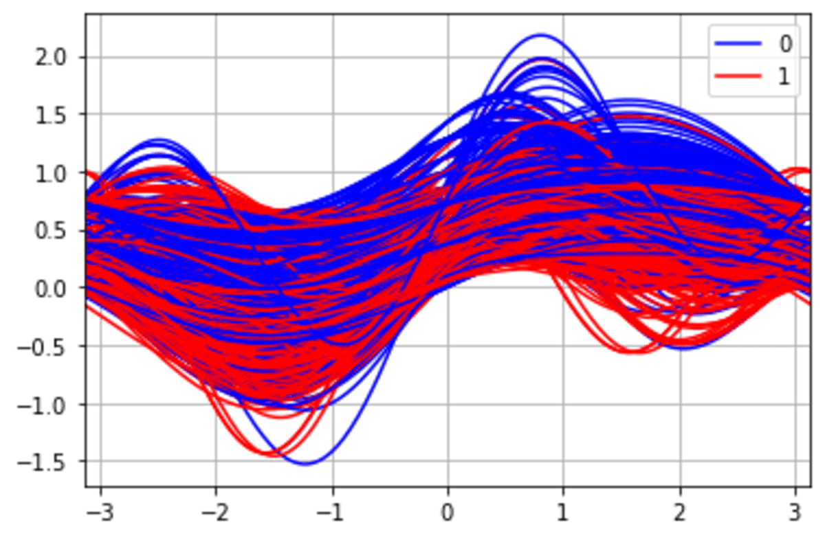
4. Andrew Curves Plot
Andrew Curves plotting is a method to visualize multivariate data to identify clusters within the data potentially.
It also could be used to identify if there is any separation within the data. Let’s try it out with the data example.
Andrew Curves works best when the data is normalized within 0 to 1, so we would preprocess the data before applying the function.
from sklearn.preprocessing import MinMaxScaler

df = df.drop(['PassengerId', 'Name', 'Sex', 'Ticket', 'Cabin', 'Embarked'], axis =1)
scaler = MinMaxScaler()
df_scaled = scaler.fit_transform(df.drop('Survived', axis =1))

df_scaled = pd.DataFrame(df_scaled, columns = df.drop('Survived', axis =1).columns)
df_scaled['Survived'] = df['Survived']

pd.plotting.andrews_curves(df_scaled, 'Survived', color =['blue', 'red'])
From the image above, we can see a potentially different cluster for the Survived class.
5. Lag Plot
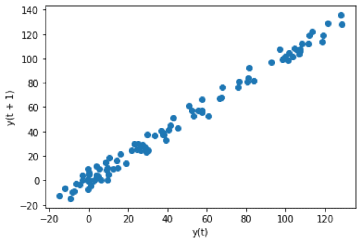
A lag plot is a visualization used in time series analysis to determine whether the data show autocorrelation.
A lag plot works by plotting the time data with their lag.
For example, T1 data with lag one would be T1 plotted against T1+1 (or T2) data.
Let’s try the functions to understand better.
We would create sample time-series data for this example.
np.random.seed(34)
x = np.cumsum(np.random.normal(loc=1, scale=5, size=100))
s = pd.Series(x)
s.plot()
Our time series data shows an increasing pattern. Let’s see what it looks like when we use the lag plot.
pd.plotting.lag_plot(s, lag=1)The data shows a linear pattern when we use a lag plot with lag 1. This means there is an autocorrelation with one-day differences in the data.
Let’s see the data to see if there is a correlation when we use it every month.
pd.plotting.lag_plot(s, lag=30)The data becomes slightly more random, although there are still linearity patterns.
That’s all for today! I hope this helps you understand that there are many Pandas plotting functions.
Are there any more things you would love to discuss? Let’s talk about it together!
👇👇👇
Previous NBD Lite Series
Don’t forget to share Non-Brand Data with your colleagues and friends if you find it useful!


