

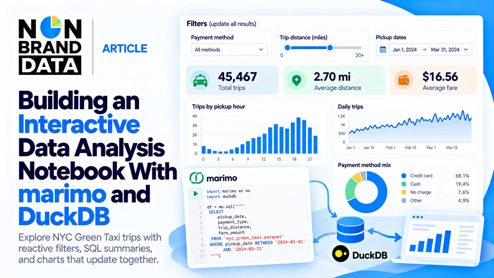
When exploring a dataset, we often repeat the same analysis for different groups. We might start with the average trip distance, then see how the result changes for cash payments or a specific week.
We can change the query and rerun our notebook. However, we also need to update the charts and make sure they use the same selection. This becomes more work as we add more questions to the analysis.
For this tutorial, we will build a notebook where we can change the filters and see the calculations and charts update together. We will use NYC Green Taxi trips as our example, combining marimo for the interactive notebook and DuckDB for the SQL analysis.
The result looks like the image below.
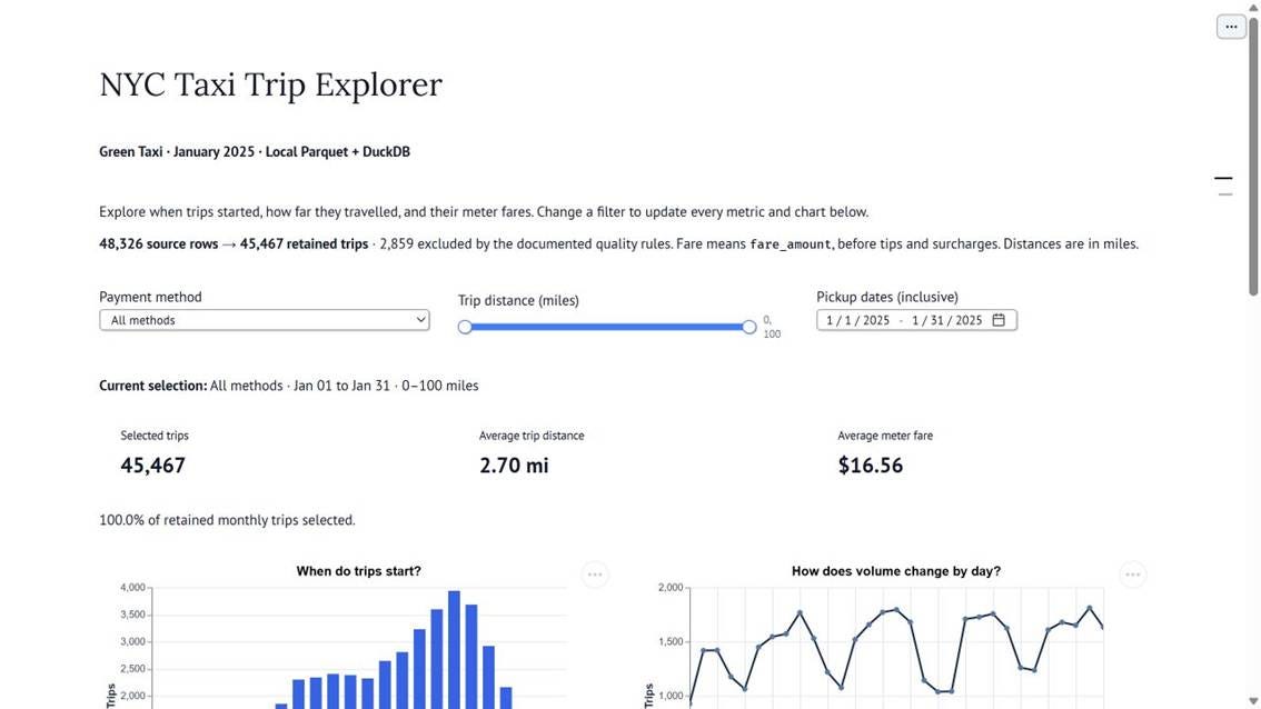
We will create payment, distance, and date controls, then use them to explore trip volumes and fares. Everything runs locally using open-source Python packages.
Let’s get into it.
Building a Notebook With marimo and DuckDB
marimo is a reactive notebook for Python and SQL. When we change a value, it can automatically rerun dependent cells. This is useful when we want a dropdown or slider to control our analysis.
DuckDB is an embedded analytical SQL engine. We can query local files directly from Python without setting up a database server. In this project, it filters the trips and calculates the results before we pass them to our charts.
First, let’s download or clone the GitHub repository.
python -m venv .venv
.\.venv\Scripts\python.exe -m pip install -r requirements.txt
.\.venv\Scripts\python.exe download_data.py
.\.venv\Scripts\python.exe -m marimo edit taxi_analysis.py
This opens the complete notebook in the marimo editor. The repository includes the dependencies and data preparation script, so we can start exploring without assembling those files ourselves.
The following examples walk through how our data, controls, and charts connect. In marimo, we put each notebook example in its own cell. If outputs are initially empty, click Run all to execute the notebook.
Preparing the NYC Taxi Data
For this example, we will use Green Taxi trips for January 2025 from the NYC Taxi & Limousine Commission. The file contains 48,326 rows and is around 1.2 MB, so we can work with the full month.
Before building the interactive part, let’s inspect the data with DuckDB. This loading example can be run separately in Python.
import duckdb
from pathlib import Path

data_path = Path("data/green_tripdata_2025-01.parquet").resolve()
con = duckdb.connect()
con.read_parquet(str(data_path)).create_view("raw_trips")

con.execute("DESCRIBE raw_trips").pl()
The code creates a view called raw_trips, which lets us query the Parquet file by name. DESCRIBE shows the available columns and their data types.
We will use the pickup and drop-off timestamps, trip distance, fare amount, and payment type. According to the data dictionary, distance is measured in miles, while fare_amount represents the meter fare. It does not include all the additional charges in the passenger’s total payment.
The data also suggests we should clean it first. The largest recorded distance is 84,731.57 miles, some fares are negative, and some pickup dates fall outside January. 1,836 records also lack a payment type.
For our explorer, I keep January pickups with a drop-off after pickup, a positive distance up to 100 miles, and a positive meter fare up to $500. Missing payment remains a separate category. These choices leave 45,467 trips.
These are tutorial limits, rather than official TLC validity rules. Long trips or negative fare adjustments can be legitimate, so the results reflect the records our rules include. The complete cleaning code and exclusion counts are available in the repository.
Combining SQL and Python
Now, let’s move into marimo. The project keeps the data preparation and query functions in analysis.py, so we can reuse them from the notebook.
First, we import the tools and functions we need.
import marimo as mo
import altair as alt
from analysis import (
 MONTH_START, MONTH_END, PAYMENT_LABELS,
 Filters, create_connection, query_dashboard,
)
Then, we connect to the prepared data.
con = create_connection()
clean_trips = con.table("clean_trips")
create_connection() creates the DuckDB views, including clean_trips for the records that passed our cleaning rules. The second line gives marimo a reference to that view without loading all its rows into a dataframe.
Let’s start with a SQL query that calculates the trip count, average distance, and average fare.
monthly_summary = mo.sql(
"""
 SELECT COUNT(*) AS total_trips,
 AVG(trip_distance) AS avg_distance,
 AVG(fare_amount) AS avg_fare
 FROM clean_trips
 """,
 engine=con,
)
We use COUNT(*) to count trips and AVG to calculate the two averages. The result is 45,467 trips, an average distance of 2.70 miles, and an average meter fare of $16.56.
marimo’s SQL cells are saved in the Python file using mo.sql. In the editor, we see the SQL query and its output. The result is also available as a Polars dataframe, so we can use it in the next Python cell.
baseline_rows = monthly_summary["total_trips"][0]
mo.md(f"The one-row SQL result summarizes **{baseline_rows:,} retained trips**.")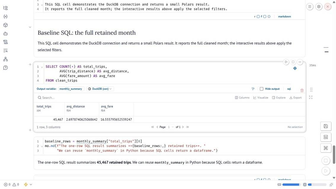
As we can see above, the Python cell reads monthly_summary from the SQL cell. We can use the same approach to pass a query result into a chart or another calculation.
The connection between cells comes from their variable names. If a cell uses monthly_summary, marimo knows it depends on the cell that creates that result. We do not need to place them in a particular execution order on the page, but each shared variable should be defined only once.
Making the Analysis Interactive
With our first analysis ready, let’s add the controls. We want to choose how the passenger paid, how far the trip traveled, and when the pickup happened.
The following code creates the three controls and places them side by side. It first reads the available payment codes so the dropdown matches our dataset.
_observed = con.execute("""
    SELECT DISTINCT COALESCE(CAST(payment_type AS INTEGER), -1) AS code
    FROM raw_trips ORDER BY code
""").fetchall()

payment_options = {"All methods": None}
payment_options.update({PAYMENT_LABELS[_code]: _code for (_code,) in _observed})

payment = mo.ui.dropdown(
    options=payment_options,
    value="All methods",
    label="Payment method",
    full_width=True,
)

distance = mo.ui.range_slider(
    start=0, stop=100, step=0.5, value=[0, 100],
    label="Trip distance (miles)", show_value=True,
    debounce=True, full_width=True,
)

pickup_dates = mo.ui.date_range(
    start=MONTH_START, stop=MONTH_END,
    value=(MONTH_START, MONTH_END),
    label="Pickup dates (inclusive)", full_width=True,
)

mo.hstack([payment, distance, pickup_dates], widths="equal", gap=2)
The dropdown starts with all payment methods, while the distance and date ranges cover the full cleaned month. We use debounce=True for the slider so the query updates when we release the handle, rather than for every movement while dragging it.
Next, let’s connect these selections to the analysis. In another cell, we read the controls’ .value properties and pass them to our query functions.
selected_filters = Filters(
 start=pickup_dates.value[0], end=pickup_dates.value[1],
 min_distance=distance.value[0], max_distance=distance.value[1],
 payment=payment.value,
)
summary, hourly, daily, payments = query_dashboard(con, selected_filters)
The query helper uses the same selection for every result. Its summary query follows this structure:
WITH filtered AS (
 SELECT * FROM clean_trips
 WHERE pickup_at >= $start_at AND pickup_at < $end_exclusive
 AND trip_distance BETWEEN $min_distance AND $max_distance
 AND (CAST($payment AS INTEGER) IS NULL OR payment_code = $payment)
)
SELECT COUNT(*) AS total_trips,
 AVG(trip_distance) AS avg_distance,
 AVG(fare_amount) AS avg_fare
FROM filtered;
The values beginning with $ are named query parameters. The helper passes the selected values separately from the SQL text. We also include the entire final day in the date selection by using the following midnight as the exclusive upper bound.
Let’s take Cash as an example. Changing the dropdown updates payment.value. marimo then reruns the analysis cell, followed by the cells that display its results. We get 11,035 trips, an average distance of 2.77 miles, and an average fare of $16.82 for the full month.
We can also combine the controls to look at a more specific group.
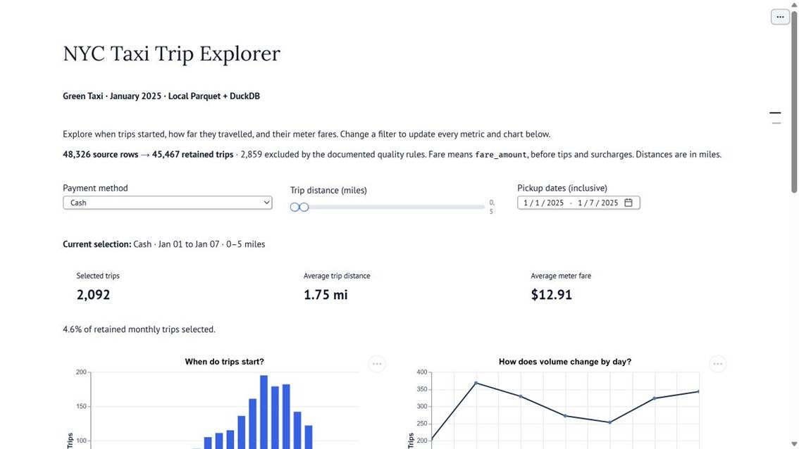
Selecting Cash, January 1–7, and 0–5 miles gives us 2,092 trips, an average distance of 1.75 miles, and an average fare of $12.91.
This is the reactive part of our notebook. We change a selection, and the cells that use it rerun. The earlier full-month SQL query stays as a baseline because it does not use these controls.'
Visualizing the Results
Now, let’s display the calculations and explore how trip volumes change throughout the day.
For the summary, we can use mo.stat to show the three metrics together.
_distance_text = "N/A" if summary["avg_distance"] is None else f'{summary["avg_distance"]:.2f} mi'
_fare_text = "N/A" if summary["avg_fare"] is None else f'${summary["avg_fare"]:.2f}'

mo.hstack([
    mo.stat(value=f'{summary["total_trips"]:,}', label="Selected trips"),
    mo.stat(value=_distance_text, label="Average trip distance"),
    mo.stat(value=_fare_text, label="Average meter fare"),
], widths="equal", gap=2)
Each metric uses the summary result from the analysis cell. This means the displayed values follow the filters we just created.
For the hourly chart, DuckDB groups the selected trips by pickup hour and counts the records in each group. We then pass that small result to Altair.
hourly_chart = alt.Chart(hourly).mark_bar(color="#2563eb", size=12).encode(
    x=alt.X("pickup_hour:O", title="Pickup hour", sort=list(range(24))),
    y=alt.Y("trips:Q", title="Trips"),
    tooltip=["pickup_hour:O", alt.Tooltip("trips:Q", format=",")],
).properties(width="container", height=220)

mo.ui.altair_chart(hourly_chart, chart_selection=False)
In the code above, mark_bar creates the bars, while the x and y definitions specify the pickup hour and trip count. The tooltip lets us inspect each value. mo.ui.altair_chart displays the result in the notebook.
The complete notebook also includes a daily line chart and a payment chart. They use the same filtered data, so we can review the daily pattern and payment mix alongside the hourly distribution.
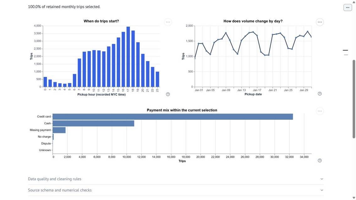
From the full-month result, we can see that 17:00 has the highest hourly count, with 3,937 trips. January 30 has the highest daily count, with 1,811 trips.
Let’s see what happens when we select Cash.
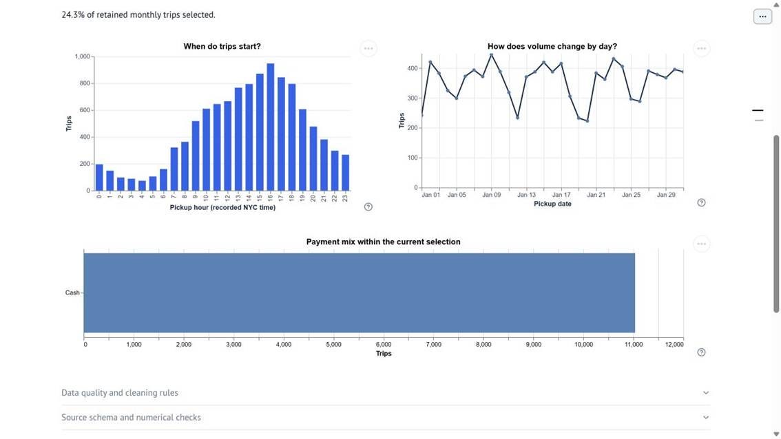
The hourly peak shifts to 16:00 with 947 trips, and the other charts update to match the selection. We can explore how the pattern changes without editing the query or manually rerunning each chart.
The results describe the selected records. They do not tell us why passengers traveled at those times or chose a particular payment method.
A selection might also return no matching trips. The notebook displays zero trips, N/A for the averages, and a message asking us to adjust the filters.
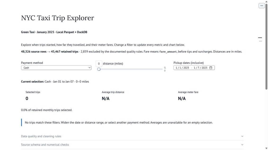
This keeps the notebook useful even when a combination of filters returns no data.
Running Our Notebook as an Application
With the notebook ready, we can run it as an application. Stop the editor with Ctrl+C, then use the following command.
.\.venv\Scripts\python.exe -m marimo run taxi_analysis.pyIn application mode, readers can use the filters and see the results without the source-editing controls. The opening image shows this view. Keep the local Python process running while using the page.
This approach works well when we want to explore different groups using the same calculations. As the dataset grows, we should check the query cost because changing a filter reruns the analysis. DuckDB aggregates before transferring results to Python, but the view itself does not cache our answers.
I checked the calculations against a separate Polars implementation and tested the filters in the running application. The GitHub repository includes the validation details, source code, and dataset instructions.
Conclusion
In this article, we built an interactive NYC Taxi Trip Explorer using marimo and DuckDB. We used SQL to analyze the trips, Python to connect the results, and notebook controls to explore different selections.
We can build on the same workflow when our analysis involves repeated queries for different groups. For the complete implementation, you can access the notebook and supporting code on GitHub.
I hope it helps!
Continue Learning with Non-Brand Data
If you are interested in learning more about Data Science, Machine Learning, and AI, you can subscribe to Non-Brand Data. I regularly share articles, experiments, and examples to learn from.
For readers who want to explore a subject in more detail, the paid subscription also includes in-depth tutorials, written courses, notebooks, code, and additional learning materials.
I also offer 1-on-1 mentorship through MentorCruise if you want to discuss your learning direction, Data Science projects, technical challenges, or career development.