
Creating a simple folium map — COVID-19 worldwide total case
From the numbers into the interactive map

From the numbers into the interactive map

All of the code shown in this article are available in my GitHub repo here.
There are many ways to create an interactive map, but my favorite way to creating it is via Folium; a map visualization library based on the Python language.
In this article, I want to show how to create a nice interactive map and with current condition right now (4 April 2020); the best data to represent the condition would be the number of COVID-19 confirmed cases in the world. Let’s get into it.
Creating The Map
For you who did not know what Folium is; it basically a map visualization library that has many built-in specific just for creating an interactive map. We could install the Folium library by using the command below.
#Installation via pippip install folium#or, installation via condaconda install folium -c conda-forgeJust like that we already have our library installed. Now, let’s try to show a simple interactive map (or base map).
import folium#Creating a base mapm = folium.Map()m
Now we already have our base map. In this case, I want to create a world map which shown a colored country section (this is basically what we called a choropleth map) of the COVID-19 confirmed case as of today (3 April 2020).
To do that, we need to actually have the data first. Luckily, there are many existing API now that provide this data. In my case, I would use the API from thevirustracker.com. Let’s try to pull some data from the API. Here are the steps to pull data from the API.
#We would use the requests module to pull the data from APIimport requests#Pulling the Worldwide COVID-19 data, we use the get function from requests module with API endpoint(Basically a URL address to request your data) as the function parameter. To know available endpoint, check the API documentationres = requests.get('https://api.thevirustracker.com/free-api?countryTotals=ALL')#We turn the data into json. It would become dictionary in the Python.covid_current = res.json()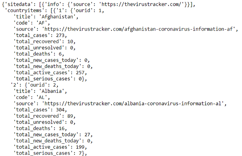
In the data above, we could see that there are much data available but in this case, I would only take the data for the Country (‘title’) and the Total case (‘total_cases’).
#Creating the COVID-19 DataFramedf = []for j in range(1,len(covid_current['countryitems'][0])): df.append([covid_current['countryitems'][0]['{}'.format(j)] ['title'], covid_current['countryitems'][0]['{}'.format(j)]['total_cases']])df_covid = pd.DataFrame(df, columns = ['Country', 'Total Case'])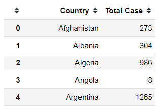
For the last data, we also need a GeoJSON data of the countries in the world. GeoJSON data is a data format representing the geographical feature, such as the country border. For our case, Folium already possessing this GeoJSON data that we could use.
#Setting up the world countries data URLurl = 'https://raw.githubusercontent.com/python-visualization/folium/master/examples/data'country_shapes = f'{url}/world-countries.json'I would clean the COVID-19 data as well because, in my next step, I would use this world country data provided by Folium on the map. In that case, I need my country name in the COVID-19 dataset to following the country name provided by Folium.
#Replacing the country namedf_covid.replace('USA', "United States of America", inplace = True)df_covid.replace('Tanzania', "United Republic of Tanzania", inplace = True)df_covid.replace('Democratic Republic of Congo', "Democratic Republic of the Congo", inplace = True)df_covid.replace('Congo', "Republic of the Congo", inplace = True)df_covid.replace('Lao', "Laos", inplace = True)df_covid.replace('Syrian Arab Republic', "Syria", inplace = True)df_covid.replace('Serbia', "Republic of Serbia", inplace = True)df_covid.replace('Czechia', "Czech Republic", inplace = True)df_covid.replace('UAE', "United Arab Emirates", inplace = True)Now we have the data to create the COVID-19 confirmed case choropleth map using the Folium. In the next step, we just need to add the choropleth layer into our base map.
#Adding the Choropleth layer onto our base mapfolium.Choropleth( #The GeoJSON data to represent the world country geo_data=country_shapes, name='choropleth COVID-19', data=df_covid, #The column aceppting list with 2 value; The country name and the numerical value columns=['Country', 'Total Case'], key_on='feature.properties.name', fill_color='PuRd', nan_fill_color='white').add_to(m)m
Just like that, we already have a simple map representing the confirmed case of COVID-19 in the world. As we can see, the United State of America as per 3 April 2020 are colored the darkest. This is because of the number of cases there are the highest right now. Some countries like Italia, China, Spain, Italy are also colored slightly darker than the other because they have the highest number of confirmed cases after the USA.
As an addition, I would add a clickable marker to show the country name. In this case, we would need the latitude and longitude of each country which is available in this csv file.
for lat, lon, name in zip(country['latitude'],country['longitude'],country['name']): #Creating the marker folium.Marker( #Coordinate of the country location=[lat, lon], #The popup that show up if click the marker popup=name ).add_to(m)m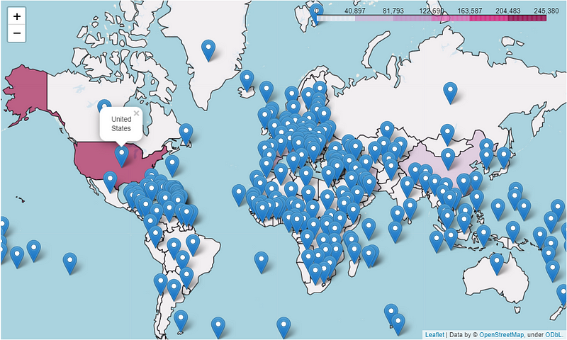
Here we are. We just create a simple interactive map from the COVID-19 confirmed case. There are still many things we could visualize such as the recovered cases, death cases, percentage, and many more.
Conclusion
Creating a simple interactive map is made easy by the Folium library, what we need is just the data which right now could be pulled via API. Choropleth is one of the maps that suitable to visualize the COVID-19 confirmed case in the world.
I hope it helps!
Note from the editors: Towards Data Science is a Medium publication primarily based on the study of data science and machine learning. We are not health professionals or epidemiologists, and the opinions of this article should not be interpreted as professional advice. To learn more about the coronavirus pandemic, you can click here.