Data Frame EDA Packages Comparison: Pandas Profiling, Sweetviz, and PandasGUI
Which pandas data frame EDA packages suit you?
Which pandas data frame EDA packages suit you?
As a data scientist, our work would always involve exploring data or often called Exploratory Data Analysis (EDA). The purposes of exploring data are to know our data better and grasp what we are dealing with.
Previously, exploring data using the pandas data frame is a big hassle because we need to code every single analysis from scratch. Not only it takes a lot of time, but it takes our mind focus as well.
Take an example of the mpg dataset below.
import pandas as pdimport seaborn as snsmpg = sns.load_dataset('mpg')mpg.head()While the data looks simple but to exploring this dataset would still take a lot of time.
Luckily, many great people already develop great packages to simplify the EDA process in our modern time. Examples of these packages are Pandas Profiling, Sweetviz, and PandasGUI.
Knowing many of the EDA packages out there, I am intrigued to see how they are compared to each other and which packages are suited better for each situation.
Let’s see how each package work and what are their main features.
Pandas Profiling
I have written a complete article about Pandas Profiling previously but let’s have a throughout recap for comparison's sake.
Fantastic Pandas Data Frame Report with Pandas Profiling
Enhance your basic reporting to the next leveltowardsdatascience.com
Pandas Profiling, for me, is the simplest of the three packages. It offers a nice quick report of the dataset. Let’s try to see how Pandas Profiling works in the field. First, we need to install the package.
#Installing via pippip install -U pandas-profiling[notebook]#Enable the widget extension in Jupyterjupyter nbextension enable --py widgetsnbextension#or if you prefer via Condaconda env create -n pandas-profilingconda activate pandas-profilingconda install -c conda-forge pandas-profiling#if you prefer installing directly from the sourcepip install https://github.com/pandas-profiling/pandas-profiling/archive/master.zip#in any case, if the code raise an error, it probably need permission from user. To do that, add --user in the end of the line.After installing the necessary package, we can use Pandas Profiling to generate our report.
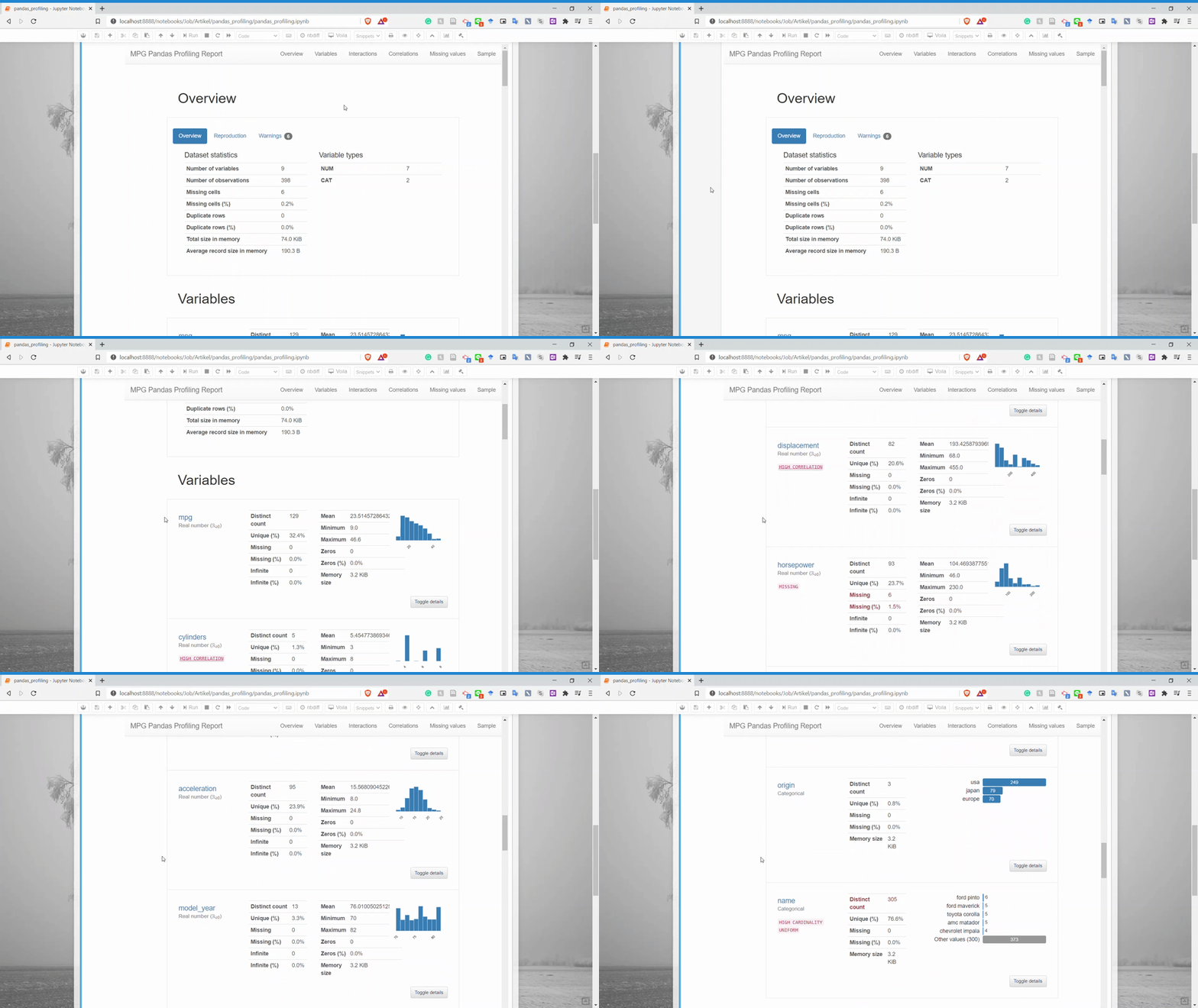
from pandas_profiling import ProfileReportprofile = ProfileReport(mpg, title='MPG Pandas Profiling Report', explorative = True)profileAs we can see above, using Pandas Profiling resulted in a quick report with nice visualization for us to understand. The report result is visualized directly into our notebook rather than open in a separate file. Let’s dissect a little bit of what Pandas Profiling gives.
There are six parts that the Pandas Profiling give — Overview, Variables, Interactions, Correlations, Missing values, and Sample.
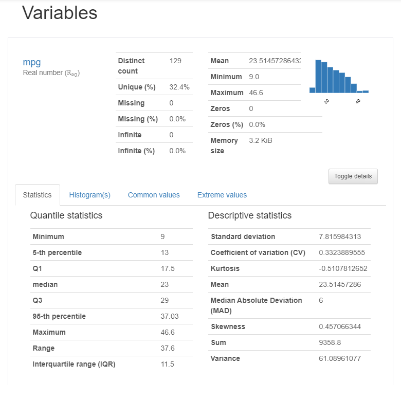
The complete part of the Pandas Profiling is the variable part because they produce a detailed report for each variable.
As you can see from the above picture, there is so much information just for that one variable. You can get the descriptive information and the quantile information just like that.
Let’s see the other information from Pandas Profiling we can get. First is the Interaction.
Interaction is the section where we could get the scatter Plot between two numerical variables.
Next is the Correlation. This is the section where we could get the relationship information between two variables. Currently, there is only four correlation analysis we could get.
The next part is the Missing Values. You could already guess what information we could get in here. Yes, it is the missing value count information for each variable.
And lastly, it is the Sample section. This only shows us the sample rows from our dataset.
That is the rough thing we could get from the Profiling Pandas report. It is simple but provides us a quick important information.
Now, what I like about Pandas Profiling is:
Quick report generated
Detailed information for every variable
Although there are some parts, I feel less inclined. There are:
Quite high memory usage
Not much detailed information between variables, only correlation and scatter plot.
The sample section just was not necessary.
For me, Pandas Profiling is great for getting quick detailed information we need. It is already enough for people who want to grasp what kind of data we are dealing with, but we need to do more detailed information.
Sweetviz
Sweetviz is another Sweetviz is another open-source Python package to generate a beautiful EDA report with a single code line. The difference from Pandas Profiling is the output is a fully self-contained HTML application.
Let’s try to install the package and generate our report.
#Installing the sweetviz package via pippip install sweetvizAfter the installation is finished, we could generate our report using Sweetviz. Let’s try it using the following code.
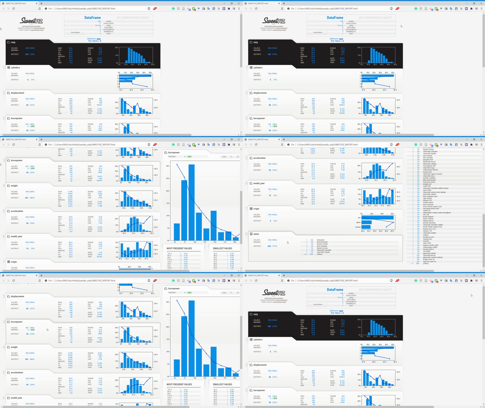
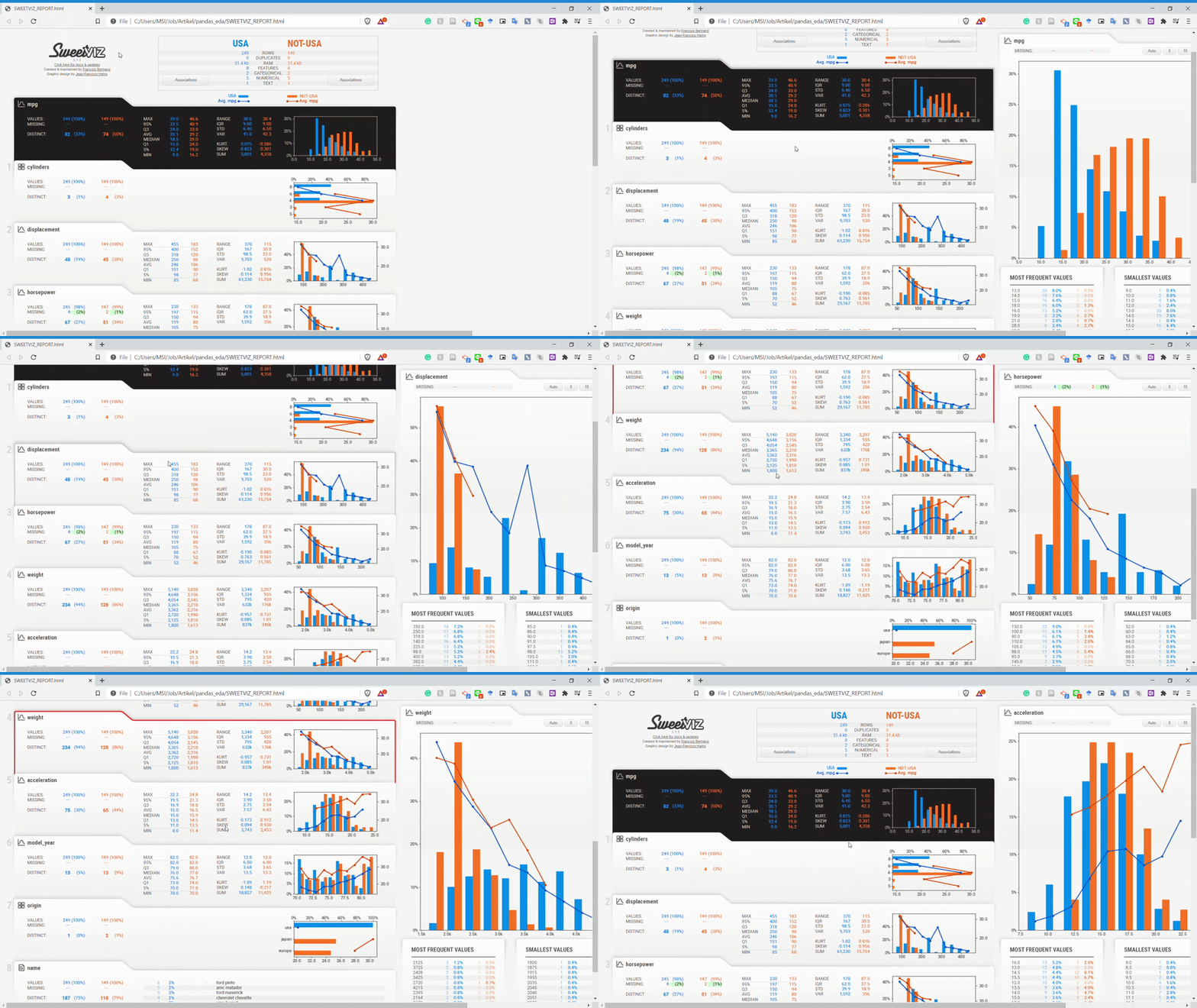
import sweetviz as sv#You could specify which variable in your dataset is the target for your model creation. We can specify it using the target_feat parameter.my_report = sv.analyze(mpg, target_feat ='mpg')my_report.show_html()As you can see from the image above, the Sweetviz report is generate something similar to the Pandas Profiling before but with a different UI. Let’s look at the overall Sweetviz report in the GIF below.
We know that every variable is described nicely with complete information when you clicked on the variable from the GIF above. Although, the information is something you could get as well using Pandas Profiling.
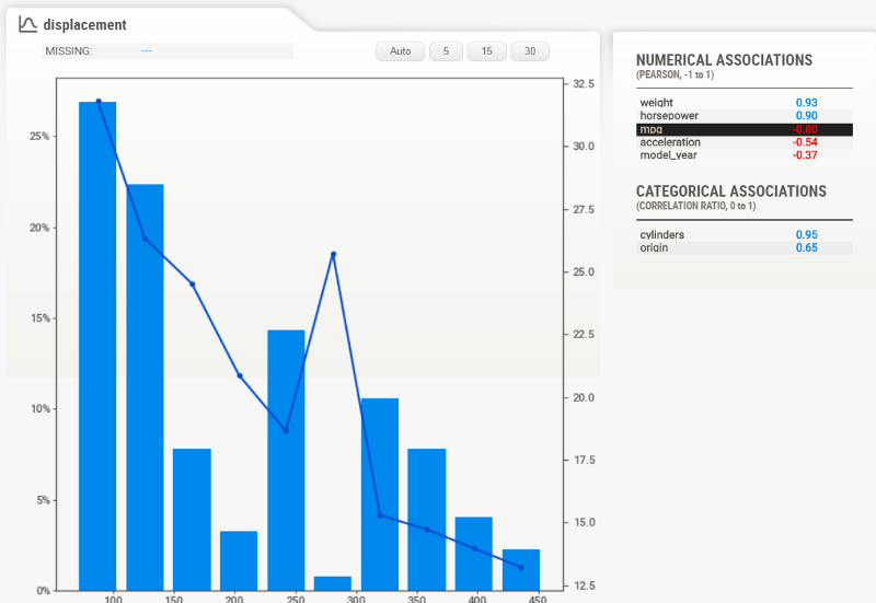
If you remember previously, we set the target feature (‘mpg’) in our code. This is one of the advantages of using Sweetviz. We can get the information in more detail concerning the target feature. For example, let’s focus on the Displacement variable and look at the detailed report on the right side.
We could see the relationship between the target feature (‘mpg’) and the displacement variable from the image above. The bar chart showing the displacement distribution, and the line chart is the target feature's average following the displacement variable. This is a great report to show us if we want to know the relation between the two variables.
On the most right side of the report, we get the correlation information for both the numerical association and the categorical association for all the existing variables. For more explanation of what the correlation analysis information is shown to us, please refer to the Sweetviz homepage.
Now, the strength of Sweetviz is not about EDA reporting on the single dataset but in the dataset comparison. Sweetviz's homepage explains that the Sweetviz system is built around quickly visualizing target values and comparing datasets.
There are two ways we could comparing dataset; either we split it, such as Train and Test dataset, or we subsetting the population with some filters. To try out, let’s try the subsetting data.
I want to know how different my dataset is when it is the USA cars' data compared to the non-USA one. We can generate the report with the following line.
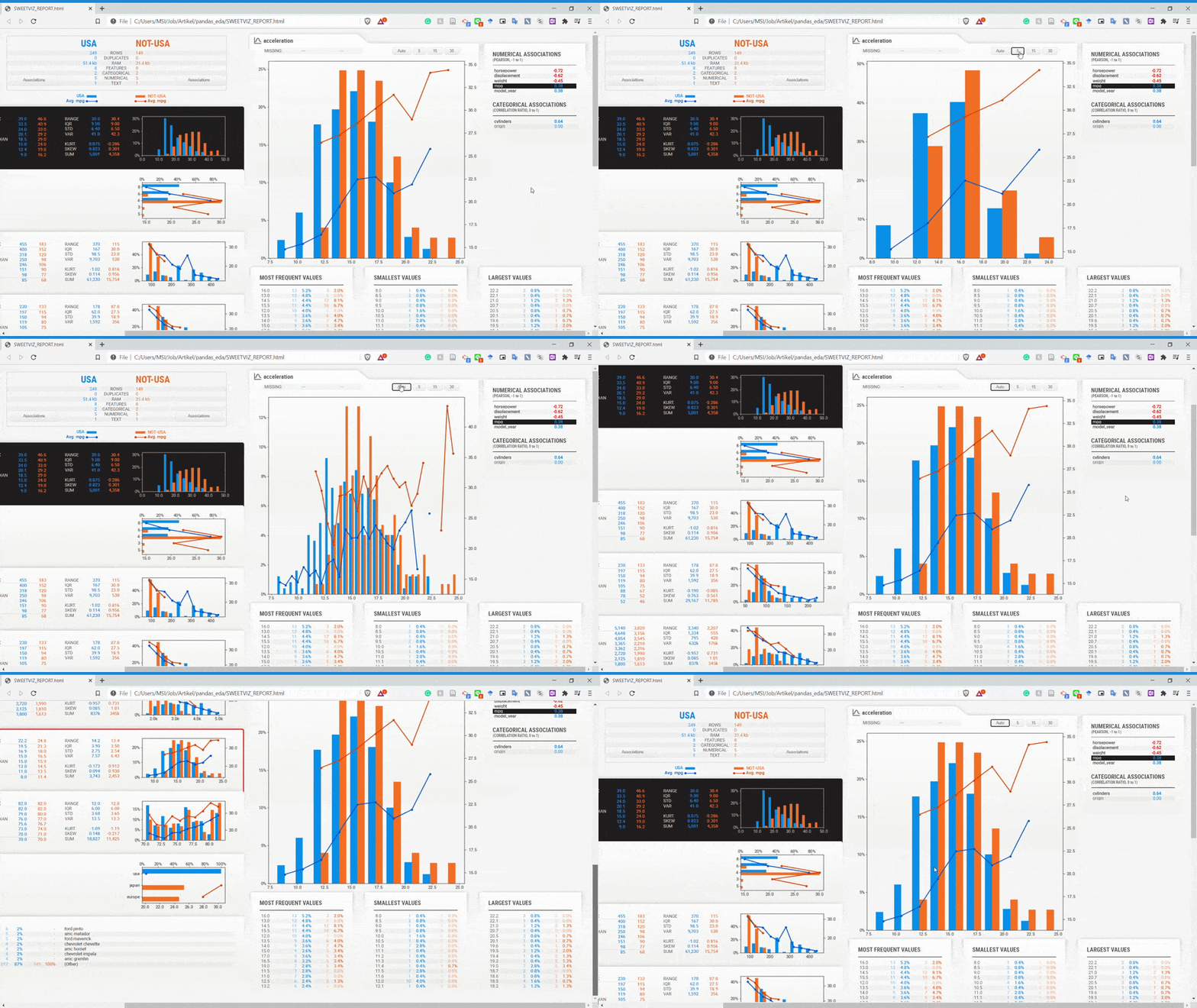
#Subsetting are happen by using the compare_intra. We input the condition in the parameter and the name as well.my_report = sv.compare_intra(mpg, mpg["origin"] == "usa", ["USA", "NOT-USA"], target_feat ='mpg')my_report.show_html()As we can see from the GIF above, we now compare the USA subset data and the NOT-USA subset. For me, this report comparison is so powerful because we can get information between the population without coding so much.
Let’s check the variable more closely.
From the GIF above, we can understand that the variables are divided by two subset populations represented in two different colors (Blue and Orange). Let’s take a look at the Displacement variable once more.
We can see that the NOT-USA (orange) displacement is much less than the USA displacement. This is the kind of information we could get instantly by comparing the two datasets.
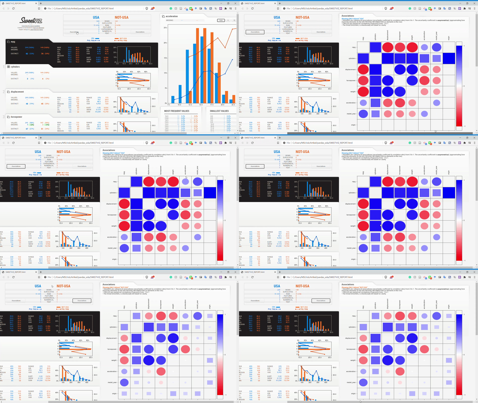
How about the associations? We can look closely at the association by using the association button on the dataset name.
From the GIF above, we can get the relationship information between two variables easily. Please refer to the homepage for a complete understanding of the association analysis.
So, what I like about Sweetviz are:
Nice visualization
Easy to understand statistical information
The ability to analyze the dataset concerning the target value
The comparison ability between two dataset
For me, Sweetviz is a step up package compared to Profiling Pandas in terms of the dataset and variable comparison. There are just a few things I feel less about that is:
No visualization between variable such as scatter plot
The report open in another tab
Although I feel that these things are not bad at all, the strength, I guess, overshadows the weakness.
In my opinion, Sweetviz is perfect for comparison analysis or dataset with a purpose to create predictive models because the Sweetviz strength is on those issues.
PandasGUI
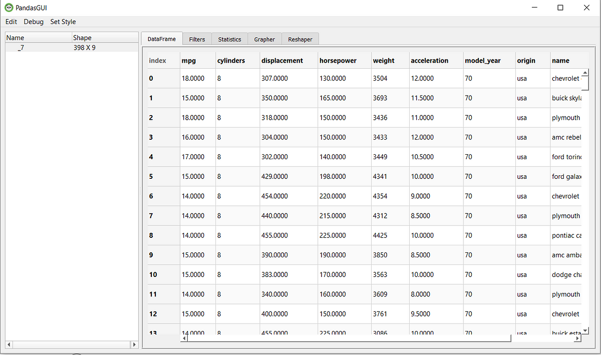
PandasGUI is different from the previous packages I explained above. Instead of generating a report, PandasGUI generates a GUI (Graphical User Interface) data frame we could use to analyze our Pandas Data Frame in more detail.
Let’s try the package. First, we need to install the PandasGUI package.
#Installing via pippip install pandasgui#or if you prefer directly from the sourcepip install git+https://github.com/adamerose/pandasgui.gitAfter the installation is done, let’s check out what PandasGUI could do. To generate the data frame GUI, we need to run the following code.
from pandasgui import show#Deploy the GUI of the mpg datasetgui = show(mpg)Just like that, the GUI should be shown up separately.
In this GUI, there are a few things you could do. Mainly Filtering, Statistic Information, Creating a plot between variables, and Reshape your data.
For a reminder, you can actually drag the tab to suit your needs. Just look at the GIF below.
Now, let’s take a closer look at each feature, starting from filtering data.
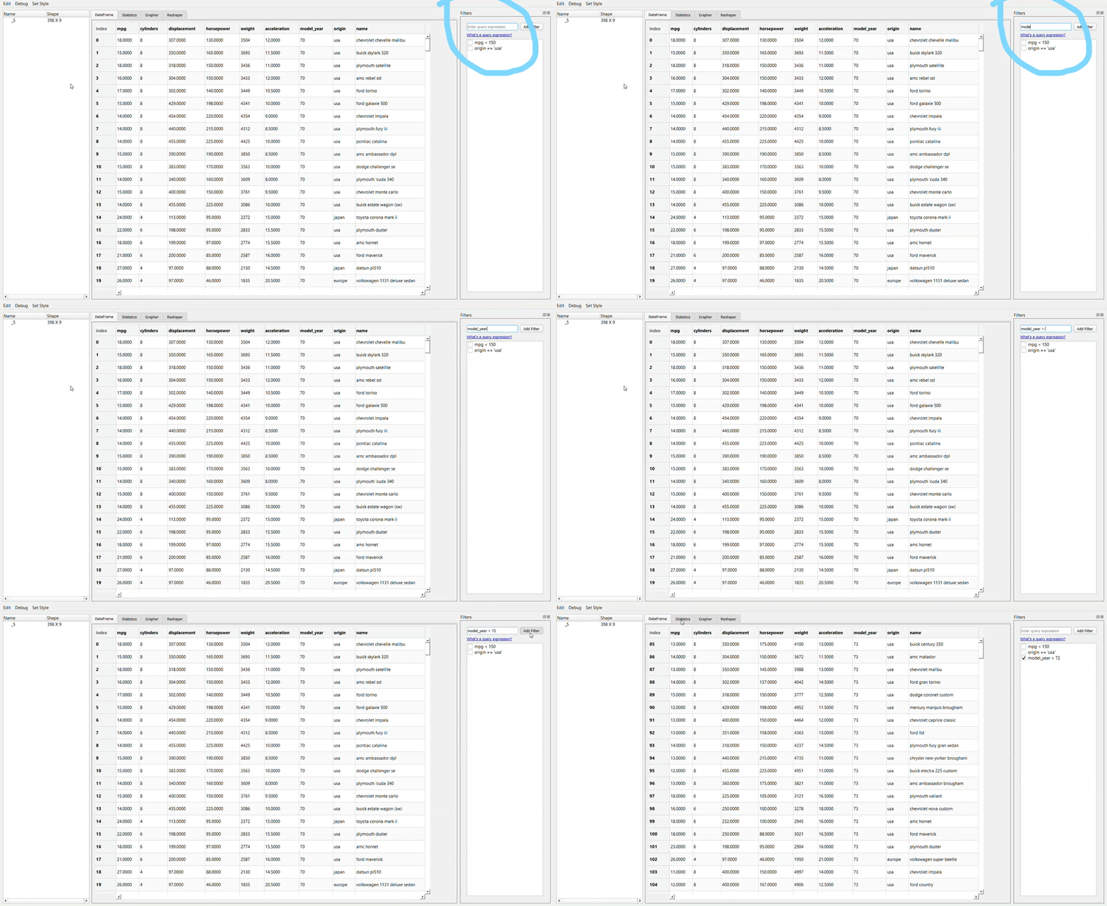
Filtering data using PandasGUI requires us to query the condition just as we write it in the Pandas data frame. Take a look at the example above; I write ‘model_year > 72’ query. The result is the query with a tick box. In this case, if we don’t want to filter the data anymore with the intended condition, we need to untick the box.
What if you make a mistake when you write your query? It is easy; you need to double-click your query and rewrite it. As simple as that.
Now, let’s take a look at the statistics tab.
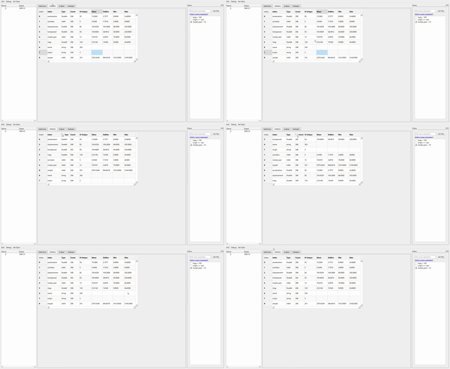
If we compare the statistical information we get from this GUI to the previous package, the information we get here is much less than the other two packages. Nevertheless, this tab shows us the basic information of the dataset.
For a reminder, any filter that we have done before would be carried around in the next activity you do in another tab, so untick any filter you feel unnecessary.
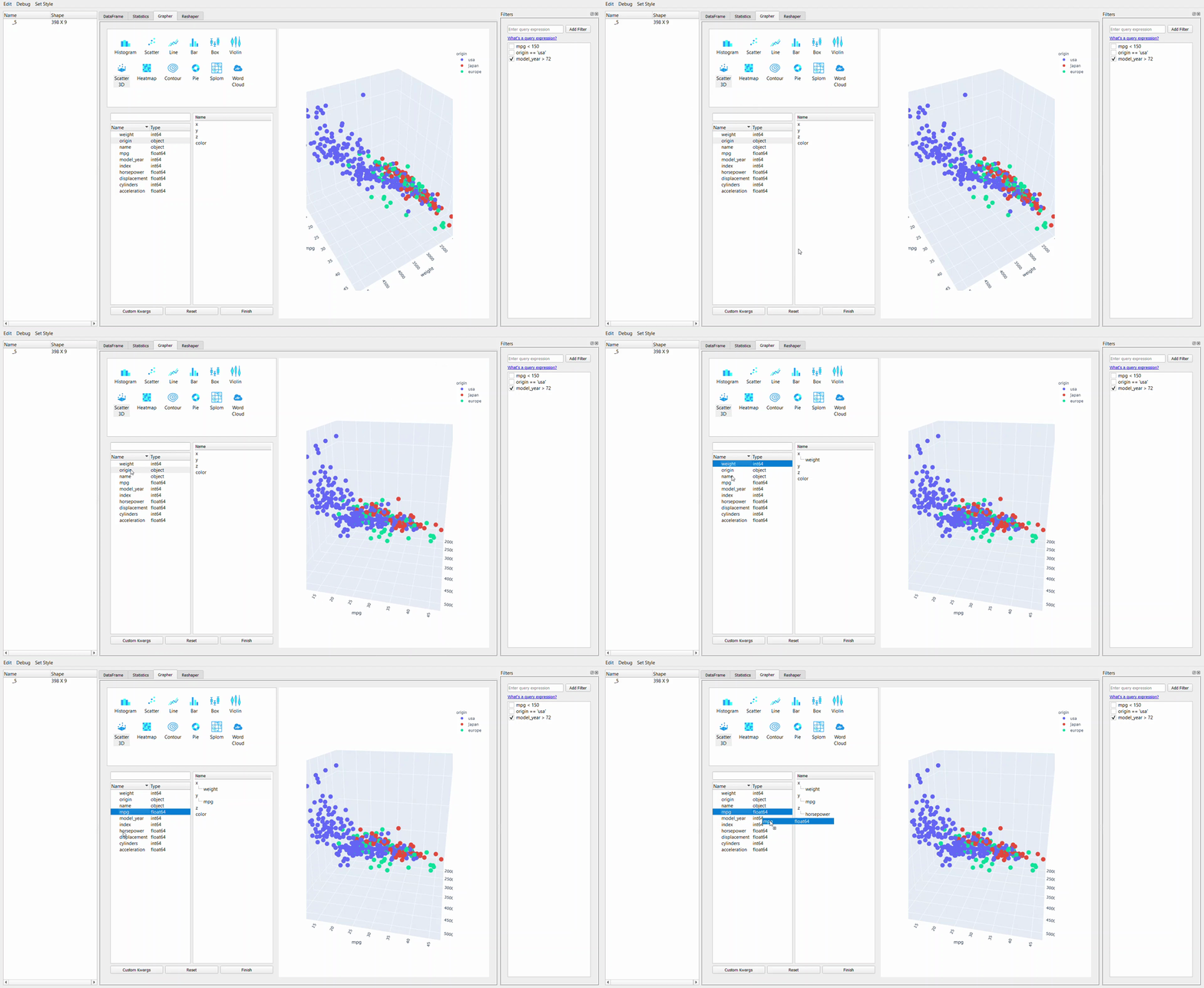
Moving on from the statistic, we now get into the Grapher tab or the plotting GUI. For me, the strength of the PandasGUI is in this tab. Let me show you why that is.
We can see from the GIF above that creating plot is just a matter of drag-and-drop everything we want. As the plotting resources rely on the plotly package, we can explore the graph by hovering the cursor to the graph.
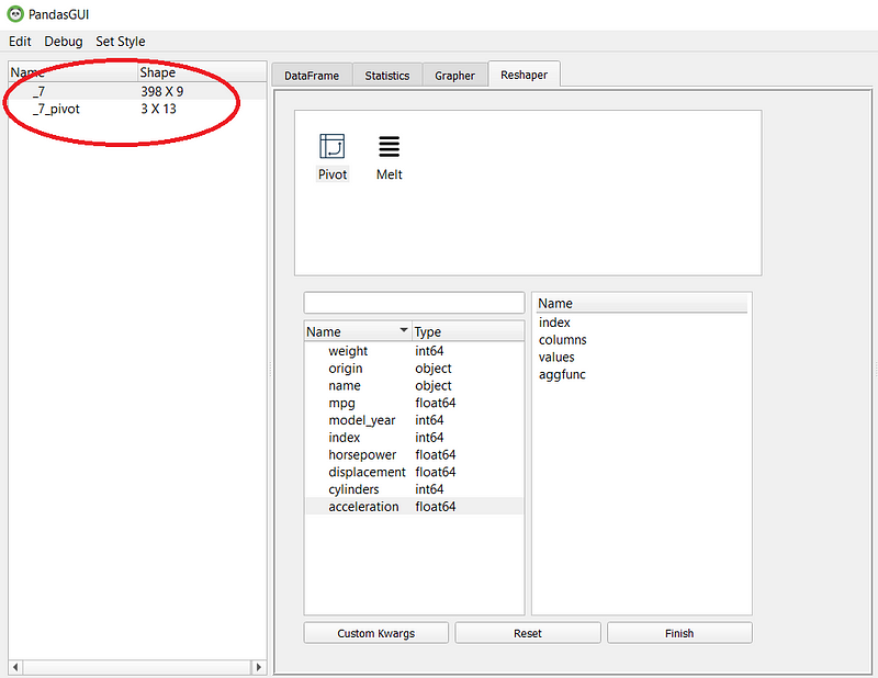
Lastly, the available tab is the reshaper tab. In this tab, we can reshape by creating a new pivot table or melt the dataset.
The pivot and melt function would result in a new table, as shown in the picture below.
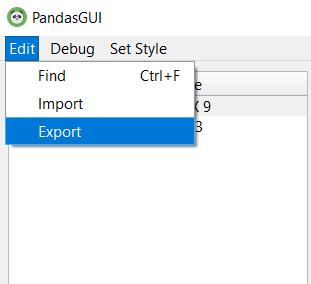
As additional information, you could import the data you have filtered or reshape into a new CSV. You need to click the Import selection from the Edit dropdown.
If you want to export a new CSV file to the PandasGUI, you could also click the Export selection shown in the image below.
Now, what do I like about PandasGUI are:
The ability to drag-and-drop
Easy filtering query selection
Fast plot creation
Although, there is some down point for me right now, and that is:
Little statistical information we could get
No automatic report was generated.
In my opinion, PandasGUI is a great package, especially for people who like to analyze the data in their own way. The package is suitable for an in-depth analysis, after all.
I think that the purpose of PandasGUI is more about exploration on our own rather than automatically generate a report. However, it is still comparable to the previous two packages as these packages help us in the EDA process.
Conclusion
Pandas Profiling, Sweetviz, and PandasGUI are amazing package developed to easing our EDA processing. Each package has its own strength and suitability in a different workstream process. If I need to conclude my comparison, that is:
Pandas Profiling suitable for a quick analysis generation for a single variable,
Sweetviz suitable for analysis between dataset and to the target feature,
PandasGUI is suitable for in-depth analysis with manual drag-and-drop capability.
That is my comparison between these three EDA packages; I would not recommend what suitable for your work because that is only you who knows.
If you want to check out more about my review on other EDA packages, you could check it out in the article below.
Quick Recommendation-Based Data Exploration with Lux
Explore your data easily with one-liner recommendation-based data explorationtowardsdatascience.com


