
Easy Interactive Plot — Pandas plotly backend
One-liner interactive plot from Pandas Series and Data Frame

One-liner interactive plot from Pandas Series and Data Frame
Pandas offer an easy way to explore data (EDA). One example is how we could create a plot just from the Pandas Series or Data Frame without importing any visualization module. Here I show you in the case below.
#I only use seaborn to import sample datasetimport pandas as pd, seaborn as snstips = sns.load_dataset('tips')tips['tip'].plot(kind = 'hist')
Just by using .plot attribute, we could produce a matplotlib plot by default. Although, in this article what I would show is how we could create an interactive plotly plot with a similar line as above. The example result is shown below.

If you want to learn more about EDA with Pandas, there is an article by Pararawendy Indarjo here that nicely covers what you could do with Pandas, Still, in this article, I would only focus on creating an interactive plot.
Plotly
Plotly is a module that improves any visualization to become more interactive. On 26 May 2020, Plotly release version 4.8.0 which supports Pandas plotting. This is a new feature that I personally excited to use. The backend is plotly-express powered, which is another package within plotly to create a fast, interactive plot. Below is an example of plotly express usage during data analysis.
import plotly.express as pxfig = px.histogram(tips['tip'])fig.show()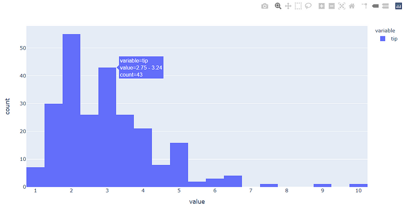
Now rather than importing the plotly.express, Plotly Version 4.8.0 has provided a backend to use it in the Pandas Series or Data Frame. To implement this, you need to install the Plotly module first.
#If you never install Plotlypip install plotly#If you have install Plotly previouslypip install -U plotlyWith the Plotly module installed, we need to set up the environment first by using the following code.
pd.options.plotting.backend = "plotly"With that, we already change our pandas plot backend from the default matplotlib to the plotly module. Let us try various plots we could create.
Scatter Plot
tips.plot.scatter(x = 'tip', y='total_bill')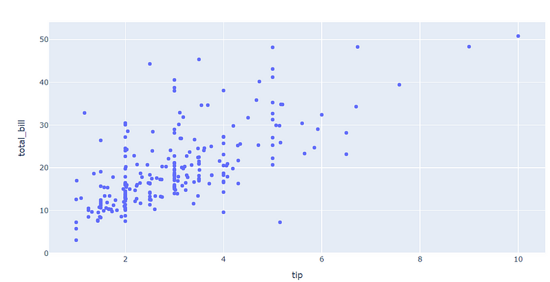
Box Plot
tips['tip'].plot.box()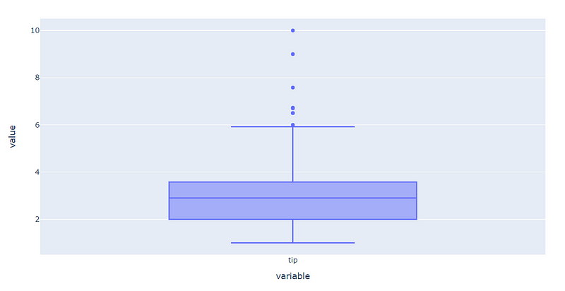
Horizontal Bar Plot
#The y axis in the Plotly bar plot is the index, that is why I set up another column as the indextips.set_index('sex')['size'].plot.barh()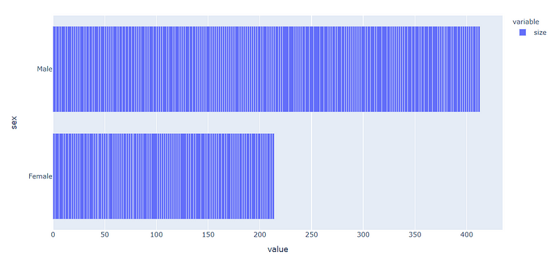
Facet Plot
tips[['tip', 'smoker']].plot.box(facet_col = 'smoker')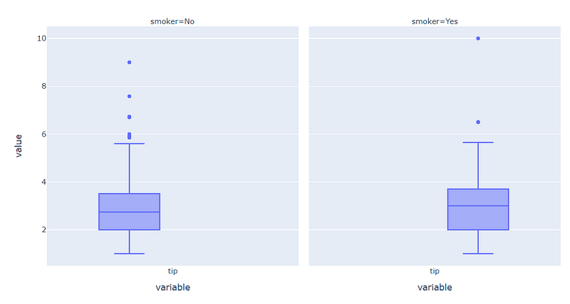
That is a few plots that supported through Pandas Plotly Backend. To be precise, currently only scatter, line, area, bar, barh, hist and box plot is available. If you want to read more about it, you could refer to the documentation here.
Conclusion
In this article, I just show how to create an easy interactive plot using plotly from Pandas Series and Data Frame. This feature is still brand new in the time of this article creation, but I am sure in the future, the function would implement many more plots that we could use.