Many Ways to Visualize Your Data via Animation
Enhance your Data Science Presentation with Animation
Enhance your Data Science Presentation with Animation
People have said that one picture worth a thousand words, it means one animation worth more than thousands of words. Why? because animation is a series of pictures, right?. We as humans are always more attentive with the presence of visuals to explain what phenomenon is happening in our data but sometime static pictures could not completely explain. This where animations make sense of what happens.
We would not always need an animation to help us understand our data, but data such as time-series data could be sometime best to be presented in the form of animation. Stock price, the number of calls each day, enrollment percentage over time, just name a few is an example of a time-series data. This data could be visualized using animation.
In this article, I want to introduce how to create a simple animation using Python programming language and various libraries out there to simplify this process. This including Matplotlib, Celluloid, and Plotly.
Matplotlib Animation
Matplotlib is a “grandfather” library of visualization and based on the MATLAB programming language. Many of the visualization libraries developed would be based on this module and I am pretty sure almost everyone who starting their visualization study would start with this module.
In the matplotlib module, there is an API specifically used to create an animation by providing the necessary base classes. There are two classes, which is FuncAnimation and ArtistAnimation. Here, I would introduce the animation created by FuncAnimation class because it is the easiest one.
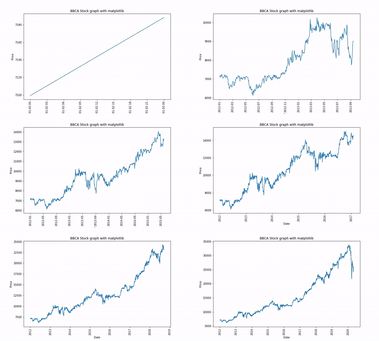
I would show how this class work by using an example of the stock price animation above. For preparation, we would need the following trinkets:
To save the animation on your system as mp4 or gif, FFmpeg or ImageMagick need to be installed.
I acquired the stock price data by using the yahoo_historical module. Install the module by using pip or conda.
Now let’s try to create our animation. First, we need to get our stock price data.
import pandas as pdfrom yahoo_historical import Fetcher#Acquire our stock price data. Here I choose to take BBCA.JK stock price (BCA Indonesia Bank) from 1 January 2012 until now with 1 day interval. The data would be automatically imported as Pandas DataFrame objectBBCA = Fetcher('BBCA.JK', [2012,1,1], interval = '1d').getHistorical()BBCA.head()Just to make sure that our data did not contain any NaN value we could do a quick check.
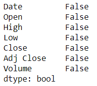
BBCA.isna().any()No NaN value is present, with this data we could preprocess the data. Because we want to create a time-series animation, we need to transform the data into the Datetime object first.
BBCA['Date'] = pd.to_datetime(BBCA['Date'])I would want to animate the Adj Close price of BBCA.JK overtime so now let’s start with the animation created using FuncAnimation class from matplotlib.
#importing librariesimport matplotlib.pyplot as pltimport matplotlib.animation as animation#Set the figure for the animation frameworkfig = plt.figure(figsize = (10,6))#creating a subplot ax1 = fig.add_subplot(1,1,1)#Preparing empty list as we want to animate the graph one data at a time rather than all at oncedate = []adjclose = []#Using FuncAnimation we need to create an animation function which return and/or done a repetitive actiondef animate(i): #Append the empty list with the data located at the index i date.append(BBCA['Date'].loc[i]) adjclose.append(BBCA['Adj Close'].loc[i]) #Clear the subplot each time the animate is called ax1.clear() ax1.plot(date, adjclose) ax1.tick_params(axis = 'x', labelrotation = 90) ax1.set_xlabel('Date') ax1.set_ylabel('Price') ax1.set_title('BBCA Stock graph with matplotlib')ani = animation.FuncAnimation(fig = fig, func = animate, frames = len(BBCA), interval = 20) plt.show()Here I would explain the parameter of FuncAnimation much closely. The important parameters here are:
fig parameter as the framework for the animation
func parameter for the animation function to be called for each frame
frames parameter is the source of data to pass into the func parameter and each frame of the animation. If int provided, it would equivalent to the function range(int).
interval parameter control the interval between each frame in milliseconds
To save the animation into mp4 or gif, just run the following code.
#You could decide wheteher it is gif or mp4 by change the extension nameani.save('bbca_stock.gif', writer='imagemagick')or if you use a Jupyter Notebook and want to see the animation directly in your notebook, you could run the following code.
from matplotlib import rcrc('animation', html='html5')aniThat is how simple animation created using the matplotlib module. In the next section, I would introduce other modules that simplify this animation creation process.
Celluloid
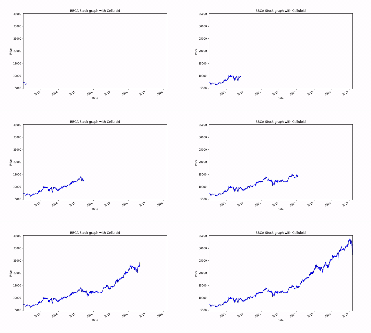
Celluloid is a module that simplifies the process of creating animations in matplotlib. We only use the figure from matplotlib and from there creates a Camera class to take a snapshot of each figure as a frame. The animation is created from the frame series.
We would try to create a simple animation of the stock price using Celluloid like an example above. For preparation, we need to install the Celluloid first.
pip install celluloidCreating animation using Celluloid rely on the repetition of the figure. Imagine that we take a burst picture and from the picture, we flip it fast to create an animation. Here is how it is written in the block of code.
#Importing Camera class from Celluloid modulefrom celluloid import Camera#Set the BBCA date as index to simplify the plotting procrss test = BBCA.set_index('Date')#Create the figure for animation creationfig = plt.figure(figsize = (10,6))#Create camera object by inputting the figure objectcamera = Camera(fig)#Looping the plotting process and taking a snapshot for each frame. I set the loop to take 50 data each time to had a faster interval.for i in range(49,len(BBCA),50): test['Adj Close'][0:i].plot(color = 'blue') plt.xlabel('Date') plt.ylabel('Price') plt.title('BBCA Stock graph with Celluloid') #Snap the figure in each loop process camera.snap() #Create the animation animation = camera.animate()animation.save('bbca_stock_celluloid.gif', writer='imagemagick')Plotly
Plotly is a visualization module that boasts as the leading front-end for ML and data science models. From a static graph, interactive visualization, to an analytic dashboard; Plotly offers all of that. The animation is also included in the Plotly module with only a few lines of code.
First thing first, we need to install the plotly module.
pip install plotlyThere are abundant functions within the plotly module, but in our case right now we would use the plotly express to create a quick plot. We would also use population data available from the plotly module.
import plotly.express as pxdf = px.data.gapminder()df.head()Our data would look like this. We have a collection of Country with 5 Year gap each time and various columns indicate their country condition. Let us try to create a quick animation using plotly from this data.
#Creating animation using plotly expressfig = px.scatter(df, x="gdpPercap", y="lifeExp", animation_frame="year", animation_group="country", size="pop", color="continent", hover_name="country", log_x=True, size_max=55, range_x=[100,100000], range_y=[25,90])fig.show()Some parameters to remember in the above code are:
animation_frame control the animation progress. We sort this value first from the earliest to the latest (or the reverse if you want).
animation_group used to provide object-constancy across animation frames: rows with matching `animation_group`s will be treated as if they describe the same object in each frame.
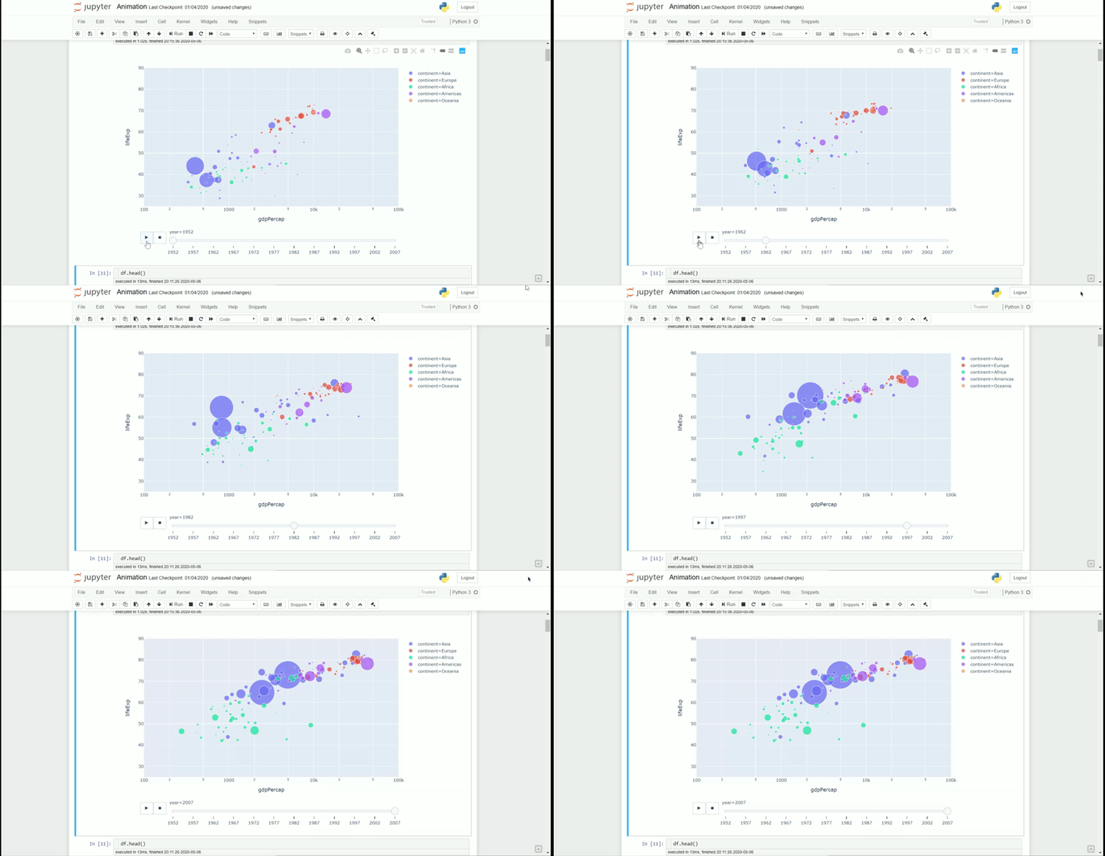
Here is the result of the animation on my Jupyter Notebook.
One weakness of the plotly is that we could not export the animation to our system (we could export the static picture but not animation). So, we use the animation process only when we using the Jupyter Notebook or we integrated it in our Plotly dashboard. As we can see, the code resulted in an interactive plot where we could play the animation (we could also hovering in our plot if we want).
Almost all the plot created by the plotly express provides the capability to create an animation, so it does not limited only to the scatter plot. Refer to the documentation if you want to know all the plot.
Conclusion
Here I have shown you a simple way to present your data via animation and several modules to help the process; this includes Matplotlib, Celluloid, and Plotly. With just a few lines of code and logic behind it, we could enhance our presentation with a nice animation.


