My top 4 functions to style the Pandas Dataframe
Why you need to stylish your pandas Dataframe and how to do it
Why you need to stylish your pandas Dataframe and how to do it

Pandas Dataframe is the most used object for Data scientists to analyze their data. While the main function is to just place your data and get on with the analysis, we could still style our data frame for many purposes; namely, for presenting data or better aesthetic.
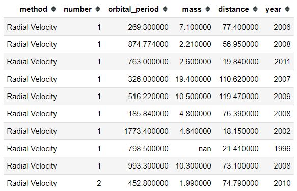
Let’s take an example with a dataset. I would use the ‘planets’ data available from seaborn for learning purposes.
#Importing the modulesimport pandas as pdimport seaborn as sns#Loading the datasetplanets = sns.load_dataset('planets')#Showing 10 first row in the planets dataplanets.head()We could style our previous Pandas Data Frame just like below.
It looks colorful right now because I put everything inside but I would break it down some of my favorite. Here are 4 functions to style our Pandas Data Frame object that I often use in everyday work.
“While the main function is to just place your data and get on with the analysis, we could still style our data frame for many purposes; namely, for presenting data or better aesthetic.”
1. Hiding Function
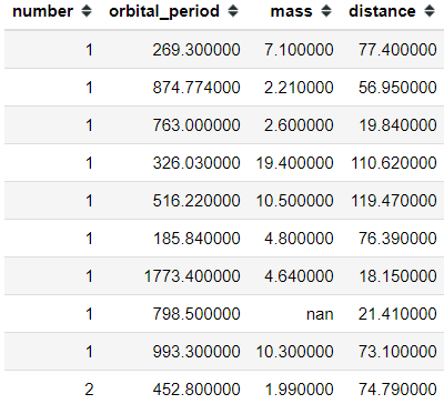
Sometimes when you do analysis and presenting the result to the other, you only want to show the most important aspect. I know when I present my Data Frame to the non-technical person, the question is often about the Index in their default number such as “what is this number?”. For that reason, we could try to hide the index with the following code.
#Using hide_index() from the style function planets.head(10).style.hide_index()Just like that, we hide our index. It is a simple thing but in the working environment I know sometimes it would become a problem. Just one extra column that becomes a question.
In addition, we could try to hide unnecessary columns with the chaining method. Let’s say I don't want to show the ‘method’ and ‘year’ columns then we could write it with the following code.
#Using hide_columns to hide the unnecesary columnsplanets.head(10).style.hide_index().hide_columns(['method','year'])2. Highlight Function
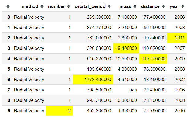
There is a time when we want to present our data frame and only highlight the important number, for example the highest number. In this case, we could use the built-in method to highlight it with the following code.
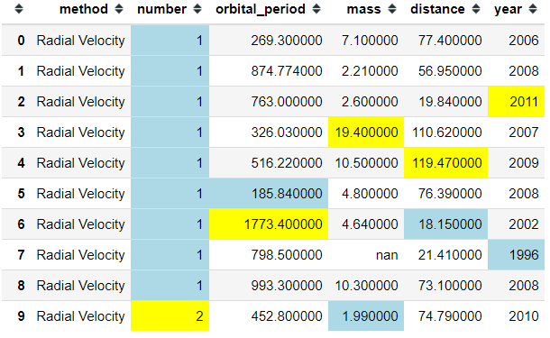
#Highlight the maximum number for each columnplanets.head(10).style.highlight_max(color = 'yellow')In the data frame above, we highlight the maximum number in each column with the color yellow. If you want to highlight the minimum number instead, we could do it with the following code.
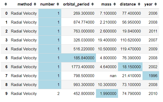
planets.head(10).style.highlight_min(color = 'lightblue')and if you want to chain it, we could also do that.
#Highlight the minimum number with lightblue color and the maximum number with yellow colorplanets.head(10).style.highlight_max(color='yellow').highlight_min(color = 'lightblue')Instead of each column, you could actually highlight the minimum or maximum number for each row. I show it in the following code.
#Adding Axis = 1 to change the direction from column to rowplanets.head(10).style.highlight_max(color = 'yellow', axis =1)As we can see, it is useless right now to change the axis as it did not highlight any important information. It would be more useful in the case when each column is not that different from each other.
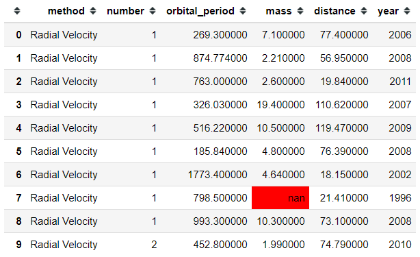
As an addition, we could highlight the null value with the following code.
#Higlight the null valueplanets.head(10).style.highlight_null(null_color = 'red')3. Gradient Function
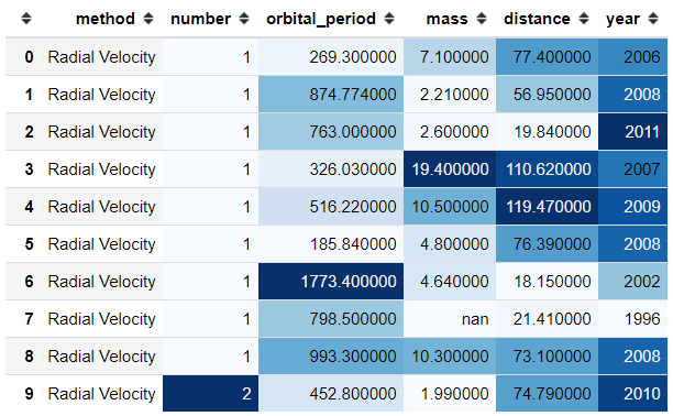
While presenting your data, we could also use all the information as the main way to present the data. I often present the data with a background color to highlight which number is in the lower area and where is the one in the higher area. Let’s use the example by the following code.
#Gradient background color for the numerical columnsplanets.head(10).style.background_gradient(cmap = 'Blues')With the background_gradient function, we could color the data frame as a gradient. The color would depend on the cmap parameter where the parameter is accepting colormaps from the matplotlib library.
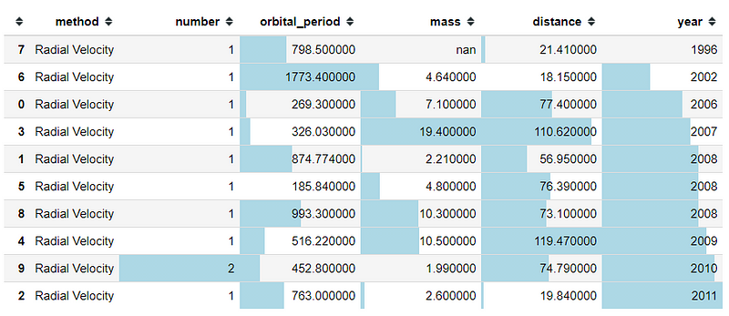
We could also use a bar chart as our gradient background color. Let me show it in the example below.
#Sort the values by the year column then creating a bar chart as the backgroundplanets.head(10).sort_values(by = 'year').style.bar(color= 'lightblue')As we could see above, we now highlight the number from the lowest to the highest number in a different way than the background_gradient function is. We could also see the index is not in order because of the sort function; it is better to hide the index as I told you in the passage above.
4. Custom Function
If you prefer to have a more specific requirement to style your data frame, you could actually do it. We could pass our style functions into one of the following methods:
Styler.applymap: element-wiseStyler.apply: column-/row-/table-wise
Both of those methods take a function (and some other keyword arguments) and apply our function to the DataFrame in a certain way. Let’s say that I have a threshold that any number below 20 should be colored red. We could do that by using the following code.
#Create the function to color the numerical value into red colordef color_below_20_red(value): if type(value) == type(''): return 'color:black' else: color = 'red' if value <= 20 else 'black' return 'color: {}'.format(color)#We apply the function to all the element in the data frame by using the applymap functionplanets.head(10).style.applymap(color_below_20_red)Just like that, every single number below or equal to 20 would be colored red and the rest is in black.
Conclusion
I have shown my top 4 functions to use when styling our data frame; hiding functions. We could style our data frame for presenting our data or just a better aesthetic. If you want to read more about what we can do to style our data frame, you could read it here.


