Python Packages for Automated EDA You Should Use
Improve your Data workflow with these packages
Data exploration is a must before any subsequent analysis, as we need to understand our data better.
Maybe there is an outlier? Or may the data distribution not be normal? Or what was the most frequent category? These kinds of questions can only be answered by data exploration.
Often, there are many explorations that we want to do. However, it only consists of the same activity. That’s why we can rely on the automatic EDA packages to perform the data exploration.
What are these packages? Let’s get into it.
Data Preparation
For this newsletter, I would use the MPG Dataset that came from the Seaborn packages. To load the data, you could use the following code.
import seaborn as sns

mpg = sns.load_dataset('mpg')
mpg.head()
The data contains nine different columns with various data types. This data would become the base for all of the exploration examples.
Let’s continue with our packages.
summarytools
The summarytools is a simple automatic EDA Python package for Jupyter Notebook. The package summarizes the data frame columns, including the statistics, frequency, distribution, and missing data.
Let’s try out the package with sample data. First, we would install the package.
pip install jupyter-summarytoolsWith the package installed, we would use them to create an EDA summary report of our MPG data.
from summarytools import dfSummary
dfSummary(mpg)
As we can see from the image above, we get a quick summary report with a single line of code.
The data summary shows the fundamental statistics such as Mean, IQR, or values. There is also a quick graph of how the data is distributed and the missing data percentages.
SweetViz
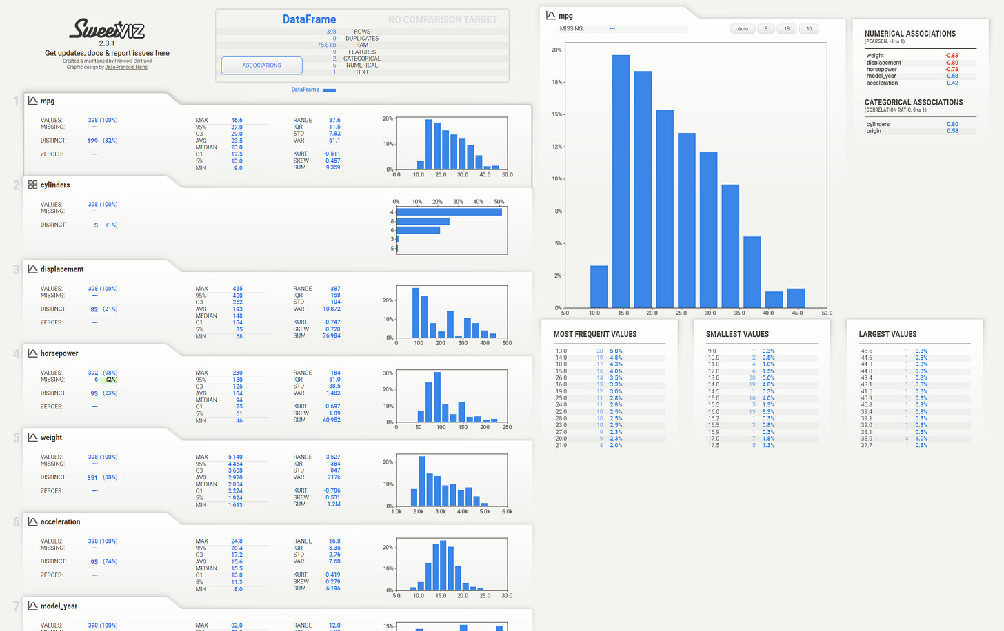
Sweetviz is a Python package for the automatic EDA process where the package aims explicitly to compare datasets and visualize the target label. However, we can perform EDA as it is without any data label.
Let’s try out the package to understand better. First, we would install the package.
pip install sweetvizNext, we would create the report with the following code.
import sweetviz as sv

my_report = sv.analyze(mpg)
my_report.show_html()
With a few lines of code, we end up with a complete report of our dataset. Every feature is calculated by inferring their data type and contains the basic statistics we need.
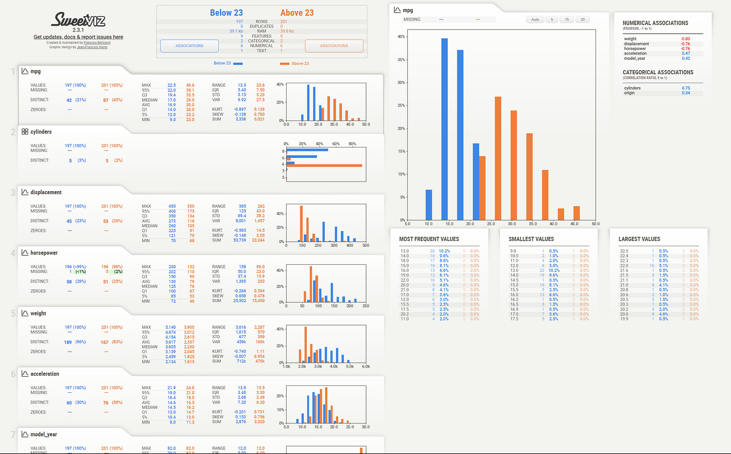
The SweetViz package also supports feature target and dataset comparison.
my_report = sv.compare_intra(mpg, mpg["mpg"] < 23, ["Below 23", "Above 23"])
my_report.show_html()
In the image above, we compare the MPG data when the mpg feature is below and above 23.
It’s a simple package to use yet intuitive, so try to explore further with it.
D-Tale
D-Tale is a Python package to view and analyze our Pandas DataFrame structure. It provides a seamless GUI integration directly to our Jupyter Notebook. Let’s try the package by installing it first.
pip install dtaleNext, let’s initiate the package by importing them and passing the dataset into D-Tale.
import dtale

d = dtale.show(mpg)
d
You would get a result similar to the image above. With this package, you can then easily explore the data by highlighting the features you want and choosing the option necessary for your analysis.
For example, I choose the Visualization and Describe option from the selection bar.
You would then get the whole section to explore the data description, which is similar to the image below.
There are so many things that you can do with this package, so I suggest you try it out.
y-data profiling
y-data profiling, previously called Pandas Profiling, is a package that offers a nice quick report of the dataset. Let’s try to see how it works.
First, we need to install the package.
pip install ydata-profilingThen, you only need to initiate the report by using the following code.
from ydata_profiling import ProfileReport

profile = ProfileReport(mpg, title="Profiling MPG Report")
With one line of code, you would get a whole report of the data information. From simple statistics, a correlation to missing values exists in this report.
y-data profiling is great for getting the quick, detailed information we need. It is already enough for people who want to grasp what kind of data we are dealing with.
Klib
Klib is a Python package designed for cleaning, analyzing, and preprocessing data. However, we will focus on the EDA aspects for now. Let’s install the package.
pip install klibThere are many functions from Klib to visualize the data. For example, I use the following function to provide the correlation plot for every numerical feature.
import klib

klib.corr_plot(mpg)
The plot would then give us the heatmap for the numerical feature correlation. We can also try out the Categorical Plot visualization.
klib.cat_plot(mpg) There are still many visualizations you can perform with this package so that you can try it out by yourself.
PandasGUI
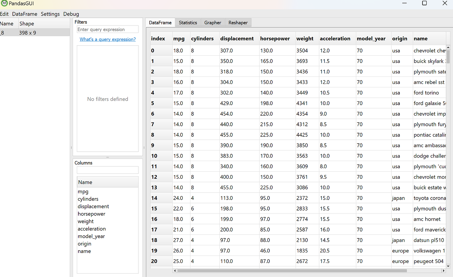
PandasGUI is different from the previous packages I explained above. Instead of generating a report, PandasGUI generates a GUI (Graphical User Interface) data frame we could use to analyze our Pandas Data Frame in more detail.
Let’s try the package. First, we need to install the PandasGUI package.
pip install pandasguiAfter the installation is done, let’s check out what PandasGUI could do. To generate the data frame GUI, we need to run the following code.
from pandasgui import show

show(mpg)
You would end up with the data frame GUI from your dataset.
With this GUI, you can try to explore your data by drag-and-drop or by clicking the option.
For example, I am trying to visualize the scatter plot between cylinders and mpg features. Then, I only need to select the Grapher tab and drag the columns I want to visualize in the graph.
It’s not a hard GUI to understand, so you should experiment by yourself.
Missingno
Missingno is a special EDA Python package that aims to provide easy-to-use missing data visualizations and utilities that get a quick visual summary of the missing data.
As usual, we need to install the package before we proceed.
!pip install missingnoFor this example, I would use the titanic data from the Seaborn package, as that dataset contains way more missing data.
titanic = sns.load_dataset('titanic')Then, we would try to visualize the missing data from our data. For example, we would generate a matrix of the nullity.
import missingno as msno
%matplotlib inline
msno.matrix(titanic)
We can see that some features have way more missing data than others.
Missingno package is also able to provide correlation and trend between the missing data. In this example, we would generate a missing data dendrogram.
msno.dendrogram(titanic)
The image shows where the missing data is strongly correlated and closely related to which features. It’s a useful feature when we want to know what causes the missing data.
Try to explore the package yourself, as there are still many features from this package that you can use.
For the whole code we use in this newsletter, you could find in the following repository.
Conclusion
EDA is a central activity for many data professionals. Sometimes, it could take too much time, so we can rely on the Python packages that specialize in the EDA.
In this newsletter, we discuss various EDA Python Packages:
summarytools
SweetViz
D-Tale
y-data profiling
Klib
PandasGUI
Missingno
I hope it helps!
Thank you, everyone, for subscribing to my newsletter. If you have something you want me to write or discuss, please comment or directly message me through my social media!


Wow! I didn't know about these tools. Love all of them!