Python Packages for Interactive Data Analysis - NBD Lite #19
Analyze your data in an interactive way.
If you are interested in more audio explanations, you can listen to the article in the AI-Generated Podcast by NotebookLM!👇👇👇
Data analysis is a staple activity for any data person, and it requires an understanding of what we are working on.
To help with the data analysis process, we have used Python for an easier workflow.
However, sometimes, we want a more interactive way to explore data.
Some have developed Python packages to explore data to answer the needs interactively.
This article will explore 3 Python packages that we could use to explore the dataset interactively, and this is the summary👇👇👇
1. PandasGUI
PandasGUI is a simple Python Package that provides GUI for dataset exploration.
The package offers a separate GUI with an Excel-like experience we could use to explore the dataset, acquire the statistics, visualize the data, and many more.
Let’s try the package for a hands-on experience.
First, we need to install the PandasGUI package.
pip install pandasguiAfter installing the package, we can instantly use it to explore our dataset. I would use the mpg dataset from Seaborn as an example dataset.
#Load Dataset
import seaborn as sns
mpg = sns.load_dataset('mpg')

#Initiate the GUI

from pandasgui import show
show(mpg)
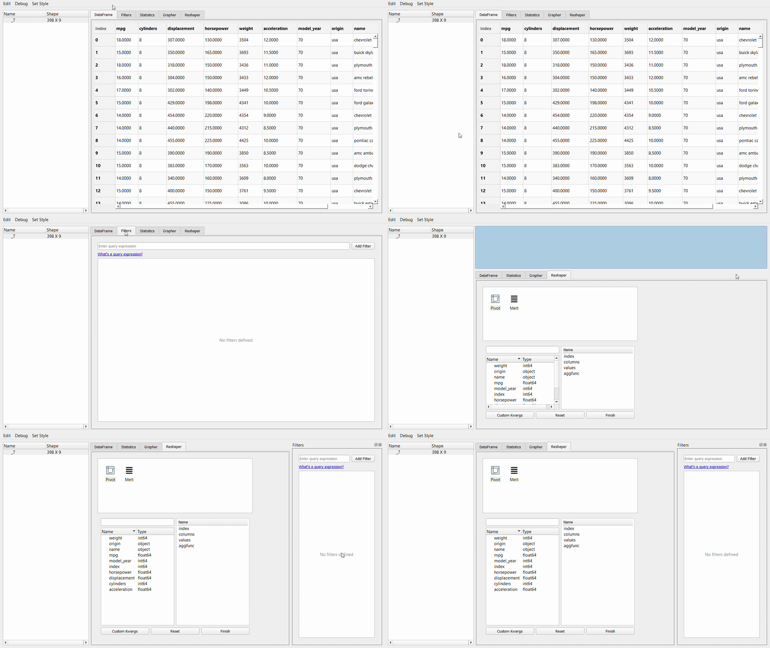
Using the above code, you will acquire the following GUI on a new screen.
The PandasGUI gives us options to explore the data with various features, including:
Data Filtering,
Statistical Information,
Plotting,
Data reshaping.
First, let’s examine the PandasGUI tabs. The GIF below shows how we could arrange the tab requirements as necessary.
Next, let’s take a look at the filtering data tab. This tab allows you to filter the data frame using a specific query. The query to fill is based on the Pandas query, so it would be familiar if you have learned about it.
Take a look at the GIF above. In my sample, I write the ‘model_year > 72’ query, where the result is the query with a tick box. The filter condition would be permanently in the query filter list, and you can untick it when you don’t require it.
If you make a mistake during the query writing, you only need to double-click the query and rewrite it. As simple as that.
Now, let’s take a look at the statistics tab.
The statistic tab provides simple variable statistics of your data, such as count, mean, and standard deviation.
It’s similar to the de’ describe attribute.
If you filter in the previous tab, the statistics will be changed according to your filter.
Next, we would go to the Grapher tab, or the plotting GUI. This tab allows you to create a single or multiple-variable plot.
Let me show you the example below.
Creating a plot is as easy as dropping and dragging. The plotly package is used for visualization, so we can explore the graph by hovering the cursor over it.
Last is the reshaper tab. This is a tab where we can reshape the dataset by creating a new pivot table or melting it.
You can also click the selection shown in the image below to import the dataset into a new CSV file or export a new CSV file to the PandasGUI.
2. D-Tale
D-Tale is a Python package for interactive data exploration that uses a Flask back-end and a React front-end to analyze the data quickly.
The data analysis could be done directly on your Jupyter Notebook or outside the notebook.
Let’s try to use the package. First, we need to install the package.
pip install dtaleThen, we could initiate the D-tale process using the following code. I would use the same MPG dataset I used in the previous sample.
import dtale
d = dtale.show(mpg)
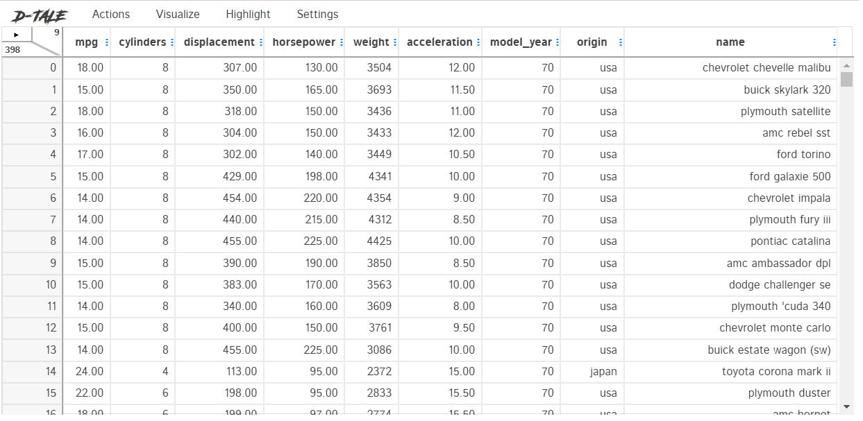
dYou could do many activities with D-Tale, and I can’t explain every single one. I will only explain the features that I feel are important for you.
Let’s take a look at the Actions tab. This tab allows us to manipulate our dataset, such as filtering, merging, or deleting. Let’s see what the action tab provides.
The action tab has all the features to manipulate your dataset, such as data conversion, creating a data frame function, and filtering. Additionally, you can get a data summary using the Summarize Data function.
If you are unsure what each function does, you could highlight the selection, and an explanation would be provided.
I feel the best feature of the D-tale is its visualization feature.
As we can see in the above image, there are various visualizations we could try out, such as:
Describe
Describe allowing us to acquire the basic statistic visualization.
Predictive Power Score
PPS Score visualization of the dataset.
Various chart
After visualization, we could use the Highlight tab to highlight various data in our dataset, such as missing data or outliers.
And lastly, you could change the D-tale setting, such as the theme, language, and screen size.
3. Mito
Let’s try to install the Mito package. Mito is a Python package that transforms your data frame into an Excel-like data analysis frame.
Imagine if you have an Excel file, but it is in your Jupyter Notebook. We could use the following code to do that.
python -m pip install mitoinstaller
python -m mitoinstaller install
After installation, we activate the Mito package to create an Excel-like sheet with the following code.
import mitosheet
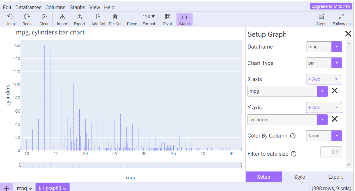
mitosheet.sheet(mpg)As we can see in the image above, the data frame we previously had is transformed into an Excel-like data sheet.
The package is easy to explore, and if you are already familiar with Excel, you will feel at home. Let’s try to use some of the features I think are helpful for data exploration.
First, we could view the column summary statistics with the View column summary statistics.
Then, we could create various graphs easily with the Graph button.
If required, we could also filter the data directly in the column.
There are still many features you could try out with Mito. If you love analysis with Excel, Mito would be a good choice.
That’s all for today! I hope this helps you quickly explore data with Python.
Are there any more things you would love to discuss? Let’s talk about it together!
👇👇👇


