Quick Recommendation-Based Data Exploration with Lux
Explore your data easily with one-liner recommendation-based data exploration
Explore your data easily with one-liner recommendation-based data exploration
As a Data Scientist, data exploration, or EDA, is our everyday work and the thing we get paid to do. There is no other skill more important to a data scientist than the data exploration skill (in my opinion). While it is important, we know that the process is a hassle and sometimes a time-exhauster. Moreover, a lot of times, we do not know where to start exploring the data.
Take the example of the mpg dataset below:
import pandas as pdimport seaborn as snsmpg = sns.load_dataset('mpg')mpg.head()Where do we start exploring data if we are not an expert in the car field, like me? In this case, we can try the recommender-based EDA using the lux package.
If you want to check out another open-source EDA package, you can check out my article here as well.
Data Frame EDA Packages Comparison: Pandas Profiling, Sweetviz, and PandasGUI
Which pandas data frame EDA packages suit you?towardsdatascience.com
Anyway, let’s see how we can use the lux package to help us explore our data.
Lux
Lux is an open-source package in Python designed to help us explore data more intelligently with their recommendation. The package was aimed at people who did not know where to start when exploring the data.
Let’s start by installing the package.
pip install lux-apiWhen you have finished installing the package, we need to enable the lux widget in our jupyter notebook.
jupyter nbextension install --py luxwidgetjupyter nbextension enable --py luxwidgetNow, let’s try using the Lux package to explore our data. First, we need to import the package to automatically setting up the widget in our notebook.
import luxJust like that, we already set up the Lux package to be integrated with the Pandas Data Frame. Next, let’s try to open any of our Data Frame; let’s try with the previously used mpg dataset.
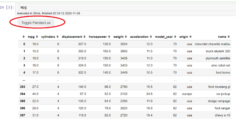
With the Lux package, we can see a new button called “Toggle Pandas/Lux” we could press. Try to press that button.
Lux Basic Visualization
Automatically, a set of visualization is created based on our dataset. in default, there are three visualization categories created; Correlation, Distribution, and Occurrence.
The Correlation tab comprised all the numerical relationships between two variables, which were visualized by the scatter plot. You can see the example in the above picture.
The Distribution tab shows a single numerical variable where the variables are visualized using a histogram plot. You can see the example in the below picture.
The Occurrence tab shows the count plot of the categorical variable. It shows each class frequency in the categorical variable, just like in the picture below.
Lux Recommendation-Based Visualization
In addition to data frame visualizations, we can specify in Lux the attributes and values we are interested in for Lux to guide our data exploration's potential next steps.
Ler’s say that I am interested in both ‘mpg’ and ‘horsepower’ attributes because I know it was related. We can specify it both in the Lux package to guide us with the .intent method, just like the line below.
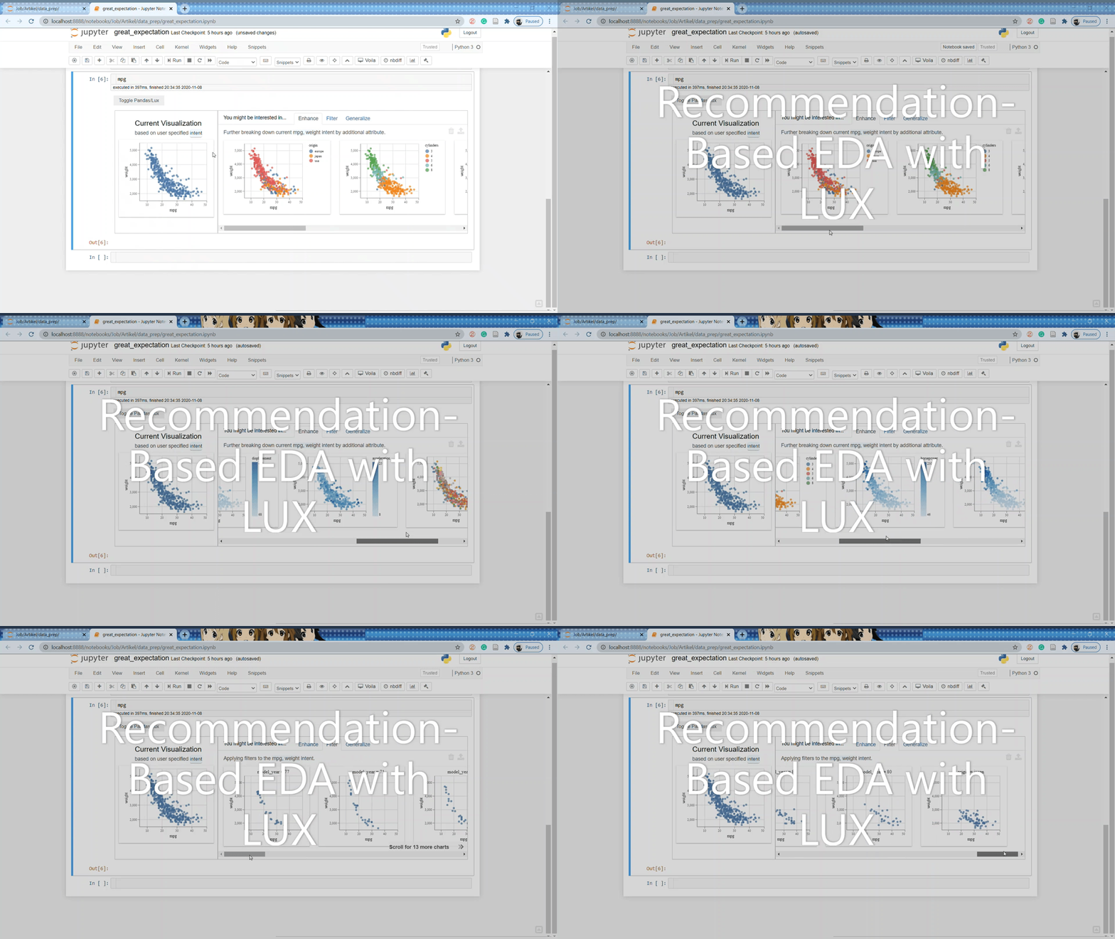
mpg.intent = ['mpg', 'horsepower']With the intent set to our data frame, the Lux package gives us the visualization recommendation. There are three different options we can see; Enhance, Filter, and Generalize.
The Enhance tab shows the visualization recommendation by adding additional variables to our current intent. Essentially it shows how another variable affecting the variables we are interested in. You can see the example in the above picture.
The Filter tab adds a filter to the current intent you have set; this is done while keeping the attributes (on the X and Y axes) fixed. The recommendation would show us the relationship between our variable filtered from another variable. You can see from the image below that the scatter plot is filtered by the model_year variable for each class the column has.
The generalize tab removes an attribute to display a more general trend, showing the attribute's distributions. The purpose is to focus on the current attribute we are interested in.
You could try a variable combination between numerical and categorical as well. Although the maximum variables for the intent, you can specify is three variables. Nevertheless, it is enough for you to explore the data easily.
Lux exporting visualization
If you want to separate one of the visualization charts into another variable, you could do that in Lux. Let’s take a look at the image below.
We only need to click on our intended chart from the image above until they show the tick mark. After that, click on the export button (the one that I gave a red circle). With this, we are already successfully exporting the chart.
So, where to access the chart? The exported chart is actually stored in our own data frame variable. Let’s try to access it then.
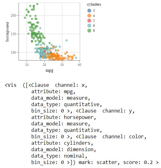
#The visualization is stored in the .exported attribute we could access any timevis = mpg.exported[0]visWith that, we have already stored our plot to a different variable.
Conclusion
Lux is a recommendation-based system EDA to help us quickly get around our data. The package helps us by giving us all the possible data combinations and exploring the data based on our own intention.


