What it takes to be correlated
and how it could be interpreted for our analysis
and how it could be interpreted for our analysis

Correlation (to be exact Correlation in Statistic) is a measure of a mutual relationship between two variables whether they are causal or not. This degree of measurement could be measured on any kind of data type (Continous and Continous, Categorical and Categorical, Continous and Categorical). Although correlation stated how it measured the mutual relationship, the presence of correlation measurement does not provide strong evidence toward causation. It implies that correlation does not mean causation. How then correlation could be useful?
Correlation is useful because it can indicate a predictive relationship that could be exploited in the practice. For example, the number of Ice cream sold are more frequently with a higher temperature in the day. This could also imply causation because when the weather is hotter, people tend to bought Ice cream compared when it is colder. However, just like I stated before; most of the time correlation cannot imply any causation.
Before we went into correlation and how it calculated, let me show the concept of covariance.
Covariance
In statistics, covariance is a measure of the association between variable X and Y. To be exact, it measures the linear relationship tendency of the variables. Here I would show how covariance is calculated.
Covariance is calculated by subtracting each member of the variable by its mean (Centering the data). These centered scores are multiplied to measure whether the increase or decrease in one variable is associated with one another. Finally, the expected value (E) of these centered scores is calculated as a summary of the association. The expected value itself in another term is the average or mean (μ).
The problem with covariance is that X and Y could take any kind of value with their respective scale. This blur the interpretation process and rendering the covariances comparison with each other to be impossible. As an example, Cov(X, Y) = 7 and Cov(A, B) = 5 would tell us that these pairs respectively are positively associated, but it is difficult to tell whether the relationship between X and Y is stronger than A and B without any additional information. This is where correlation becomes useful — by standardizing covariance via variability measurement in the data, it would produce a product that has intuitive interpretations and consistent scale.
Now, let us get through to our first correlation.
Pearson Correlation Coefficient
Pearson Correlation is one of the most used correlations during the data analysis process. Pearson correlation measures the linear relationship between variable continuous X and variable continuous Y and has a value between 1 and -1. In other words, the Pearson Correlation Coefficient measures the relationship between 2 variables via a line.
Let us see how the Pearson Correlation Coefficient calculated.
If you notice, the top side of the fraction equation (numerator) is similar to the covariance equation we previously just discussed. This means we could also state the Pearson Correlation Coefficient as below.
The equation above stated that the covariance is divided by multiplication of the X standard deviation (σX)and Y standard deviation (σY). The division process by the standard deviation is to standardize our data and ensuring the correlation value would fall within the 1 to -1 range. This eases our correlation interpretation. So, how can we interpret the Pearson correlation?
When the correlation coefficient is closer to value 1, it means there is a positive relationship between variable X and Y. A positive relationship indicates an increase in one variable associated with an increase in the other. On the other hand, the closer correlation coefficient is to -1 would mean there is a negative relationship which is the increase in one variable would result in a decrease in the other. If X and Y are independent, then the correlation coefficient is close to 0 although the Pearson correlation can be small even if there is a strong relationship between two variables.
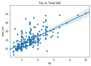
If you realize from the above explanation, actually there is a clear connection between the Pearson Correlation Coefficient and the slope of the regression line. First, let me show an example of a scatter plot with their regression line.
In the figure above, the regression line is optimal because it minimizes the distance of all points to the regression line. Because of this property, the slope of the regression line of Y and X is mathematically equivalent to the correlation between X and Y, standardized by their standard deviations.
In other words, the Pearson correlation coefficient reflects the association and amount of variability between the two variables. This property also implies that the Pearson correlation is susceptible to the outlier.
This relationship with the slope of the line has shown why Pearson correlation describes the linear relationship and why correlation is important in predictive modeling.
What if we want to measure the non-linear relationship between the variable? There are some other measurements to describe this non-linear relationship which I would show next.
Spearman Rank Correlation
Unlike the Pearson Correlation Coefficient, Spearman Rank Correlation measures the monotonic relationship (Strictly increase or decrease, not both) between two variables and measured by the rank order of the values. The correlation still measured between continuous variable X and continuous variable Y, although the Spearman Rank Correlation method still relevant to the discrete ordinal variable.
Here we calculate the Spearman Rank Correlation based on the data rank instead of the scores. Which means we calculate the covariance between the data rank and the rank standard deviation. If all the rank is unique or no tie between the rank, we could simplify the equation as below.
Where n is the number of observation and d is the difference between rank. This formula only strictly used when no ties present.
Spearman rank correlation could be interpreted similarly as the Pearson correlation coefficient as their value falls between -1 to 1. The closer the score to 1 means that there is a positive monotonic relationship between the variable (the data keep increasing) and vice versa. If variable X and variable Y independent, the value would be equal to 0.
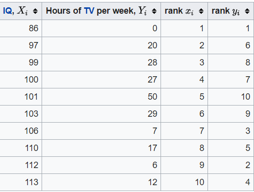
While we talk about rank, what is exactly rank is? Below is an example of the ranking process I have taken from Wikipedia.
The easier way to understand the ranking is that we order the data from the smallest to the largest and we assigning the ranking depending on the data order. 1 is the smallest ranking, it means that rank 1 is assigned to the smallest value of the respective column. Why the respective column? we could see from the table above that we rank the data based on their respective columns and because we want to know the covariance between the ranking of column X and column Y; we assign the rank w.r.t. each column. To be precise, what we want is the ranking difference between each row.
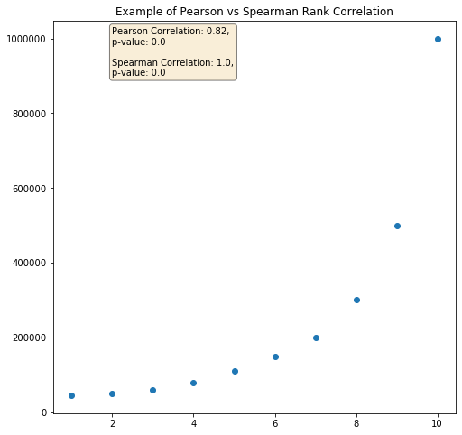
The difference between Pearson and Spearman Correlation is best illustrated in the picture below.
Since our data above showing the perfect positive monotonic relationship (the data is always increasing) and non-linear relationships; our Spearman correlation is equal to 1. In this case, the Pearson relationship is weaker but still shown a strong association as there is a partial linearity relationship between the data.
Kendall Tau Rank Correlation
Another way to measure the non-linear relationship between variables is by applying Kendall’s Tau Rank Correlation. Kendall Tau rank correlation coefficient measures the degree of similarity between two sets of ranks given to the same set of objects. However, unlike Spearman’s coefficient, Kendall Tau only measures directional agreement, not the rank differences. Therefore, this coefficient is more appropriate for discrete data. Below is how we measure the Kendall Tau Correlation.
Where Concordant pairs are pairs of values ((x1, y1), (x2, y2))in which ranks coincide: x1 < x2 and y1 < y2 or x1 > x2 and y1 > y2. Discordant pairs are ranks pair not following these
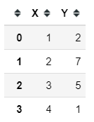
From the equation above, we could see the measurement would depend upon the number of inversions of pairs of objects. In order to evaluate them, each rank order is represented by the set of all pairs of objects (e.g., [a, b] and [b, a] are the two pairs representing the objects a and b). Let’s use a sample dataset to measure our correlation.
Above is a sample dataset with ranking in their respective columns. We would need to count the number of concordant pairs and the discordant pairs according to our previous rule. (1,2) and (2,7) are concordant pair as 1<2 and 2<7 while (1,2) and (4,1) are discordant pairs because 1 < 4 but 2 > 1. If our dataset example case, the concordant pairs are:
(1,2) and (2,7)
(1,2) and (3,5)
and the discordant pairs are:
(1,2) and (4,1)
(2,7) and (3,5)
(2,7) and (4,1)
(3,5) and (4,1)
This means we have 2 concordant pairs and 4 discordant pairs. Using the previous equation 2–4/(4(4–1)/2) would yield -0.33.
Kendall Tau will take values between −1 and +1 with a value closer to −1 means when one rank order is the exact reverse of the other rank order and the closer the value to +1 means both rank orders are identical. Kendall Tau correlation could be also interpreted as a probability difference between the probability of object in the same order (concordant) with observation in a different order (discordant).
Kendall Tau is good to be used in the case we want to know if the order of the variables is similar or not; especially if our data is discrete. However, there are other ways to measure discrete variable correlation (Shaked Zychlinski have written a really good article about it here but I want to elaborate it even more)
Cramer’s V
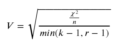
Cramer’s V is a measure of association between two discrete variables. The measurement is based on the Pearson chi-square statistic and has an output range between 0 to 1; The closer the value to 0 means less association between the two variables and 1 means strong association between the two variables. There is no negative (-) value as an output because there is no such thing as a negative association. Cramer’s V calculation is calculated in the equation below.
Where χ² is chi-square statistic, n is the number of observations, k is the number of the columns, and r is the number of the rows.
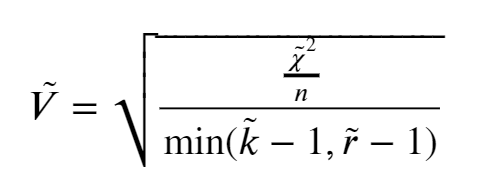
Because Cramer’s V overestimate the association strength (chi-square statistic value tends to increase with the increasing of differences between the number of the row and columns), we need to correct the bias. This was done by the equation below.
where
Example with Dataset
Luckily scipy and pandas module in python has provided us an easy way to calculate all the numbers. In my case, I would use the tips sample dataset from seaborn.
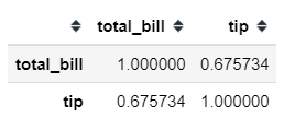
#Importing the important moduleimport pandas as pdimport matplotlib.pyplot as pltimport seaborn as sns#Load the datasettips = sns.load_dataset('tips')#Creating new category based on the tip feature (0: tip below 3 and 1 tip equal or more than 3)tips['tip_category'] = tips['tip'].apply(lambda x: 1 if x>3 else 0)Let’s say we want to know the relationship between the total_bill and tip feature. Using the pandas method .corr, we could get our correlation measured in a matter of seconds. Pandas .corr method only provides 3 kinds of correlation measurement; Pearson, Spearman, and Kendall.
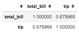
#Using the .corr method from pandas, default is Pearson Corellation tips[['total_bill', 'tip']].corr()tips['total_bill', 'tip']].corr('spearman')If we need the correlation result as statistical hypothesis testing, we could use the function from the scipy module to calculate this.
from scipy.stats import pearsonr, spearmanrpearsonr(tips['total_bill'], tips['tip'])#Output: (0.6757341092113647, 6.6924706468630016e-34)spearmanr(tips['total_bill'], tips['tip'])#Output: SpearmanrResult(correlation=0.6789681219001009, pvalue=2.501158440923619e-34)#Where the first number represent the Correlation Coefficient and #the second number represent the p-value.In correlation analysis, we could test the statistical hypothesis whether there is a relationship between the variable or not. Formally it is stated as:
H0: There is no statistically significant relationship between variable X and variable Y
H1: There is a statistically significant relationship between variable X and variable Y
Just like any other hypothesis testing, we evaluate our hypothesis based on the p-value. Commonly, we set the alpha level 95% means if the p-value is below 0.05 then we reject the H0 and accept the H1. In this case, H0 is similar if we say that Variable X and Variable Y are independent.
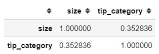
We could also calculate the Kendall Tau correlation similarly to the way above. As I previously stated that Kendall Tau correlation is more appropriate to be applied for a discrete variable, for that I would take an example relationship between size and tip_category.
tips[['size', 'tip_category']].corr('kendall')from scipy.stats import kendalltaukendalltau(tips['size'], tips['tip_category'])#Output: KendalltauResult(correlation=0.3528363722264162, pvalue=6.456364135002584e-09)Calculating Cramer’s V need an additional module and the corrected bias version needs to be defined on our own. For the uncorrected version, we could use the researchpy module to help calculate our Cramer’s V. Let’s applied it in the relationship between sex and size variable.
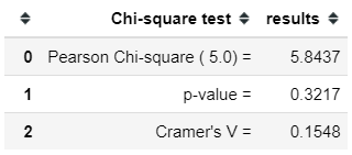
pip install researchpy #only if you never have this module beforefrom researchpy import crosstabcross, res = crosstab(tips['sex'], tips['size'], test = 'chi-square')resUsing researchpy, we would get the information we need regarding the statistical test and the correlation analysis. Although, as I said before it has not corrected yet which means it overestimates the association strength. For that reason, I would use the bias-corrected Cramer’s V function defined by Shaked Zychlinski previously.
def cramers_v(x, y): import scipy.stats as ss confusion_matrix = pd.crosstab(x,y) chi2 = ss.chi2_contingency(confusion_matrix)[0] n = confusion_matrix.sum().sum() phi2 = chi2/n r,k = confusion_matrix.shape phi2corr = max(0, phi2-((k-1)*(r-1))/(n-1)) rcorr = r-((r-1)**2)/(n-1) kcorr = k-((k-1)**2)/(n-1) return np.sqrt(phi2corr/min((kcorr-1),(rcorr-1)))cramers_v(tips['sex'], tips['size'])#output: 0.058202656344848294As we could see above, the association strength between the corrected and uncorrected version would be different.
Conclusion
I have shown a few ways to measure the relationship between variables and how we could interpret the measurement.
It is tempting to conclude that there is causation between the correlated values, but as many have said before ‘correlation does not imply causation’. Things might not be as straight-forward as the number shown. What we need is critical thinking to dissect information we get from this correlation before we could conclude anything.


